Defining a new benchmark in premium shooting experiences.
– Creative Direction
– Print Design
– Brand Identity
– Web Development
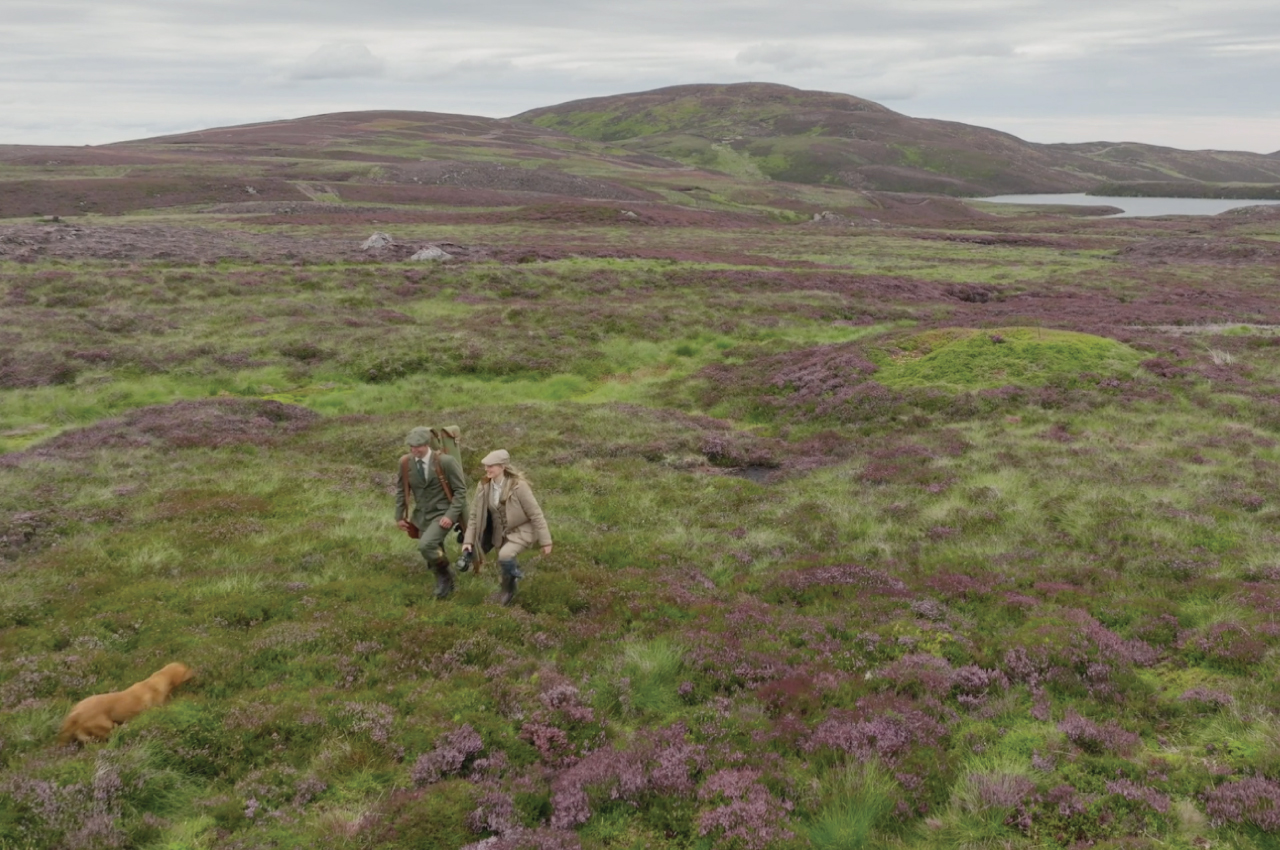
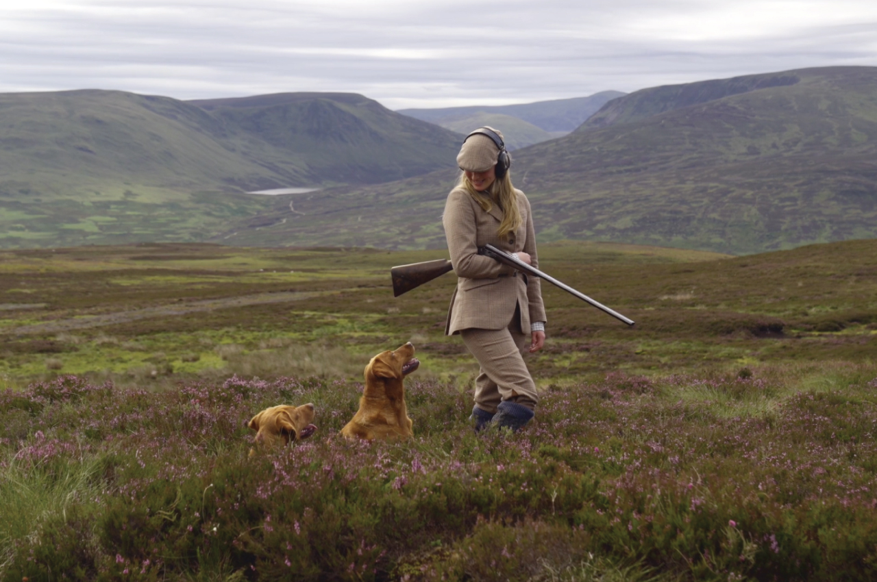
The sport of clay shooting demands precision, control, and discipline-qualities that became the foundational inspiration for Driven Clay Co. Established to deliver a superior shooting experience for seasoned guns and newcomers alike, the brand needed to combine traditional fieldcraft with a refined, modern approach.

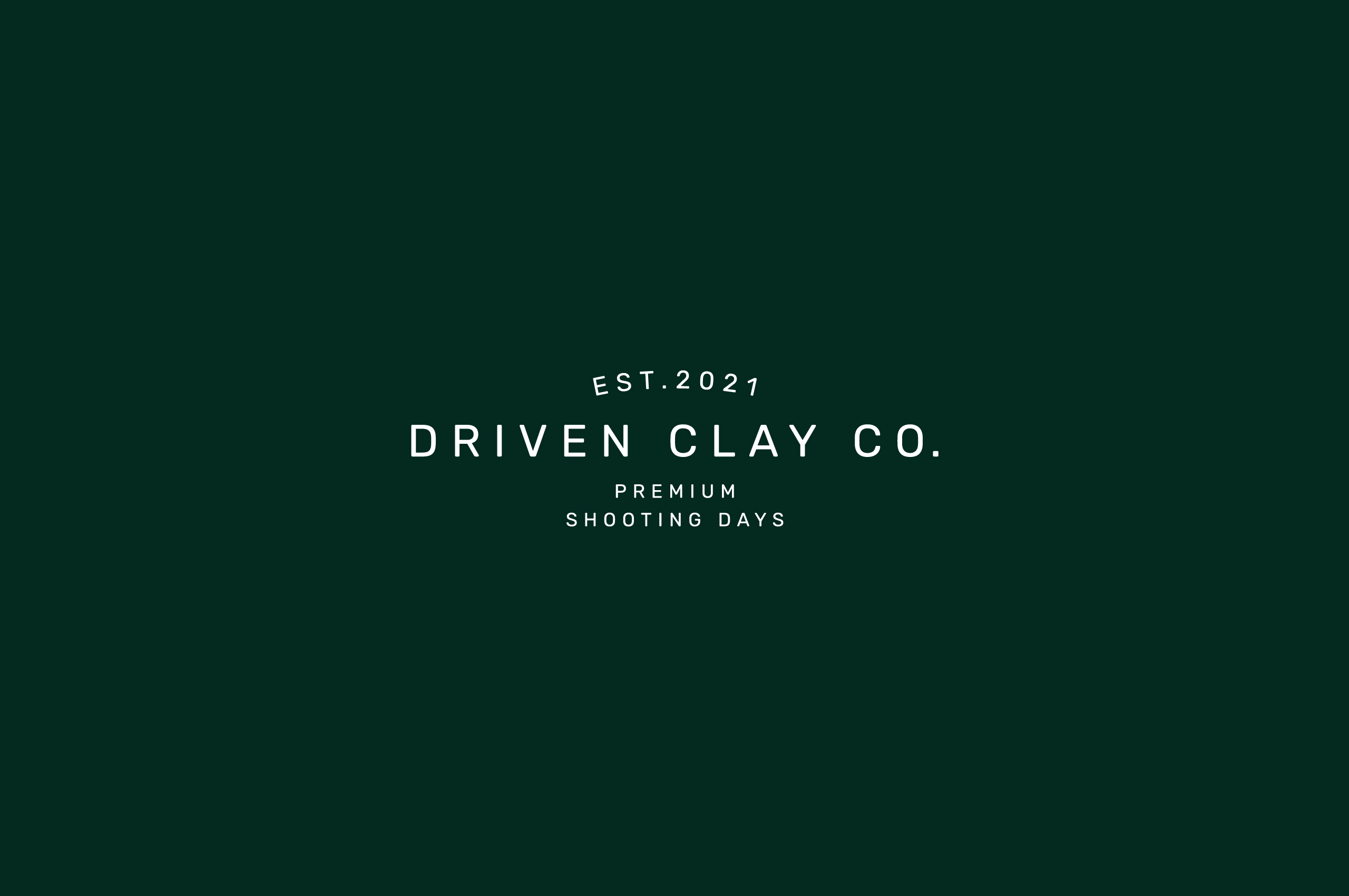
I developed a complete identity system from the ground up. The name ‘Driven’ was chosen to capture the determination, expertise, and forward motion of the sport itself-a word that conveys both movement and mastery.
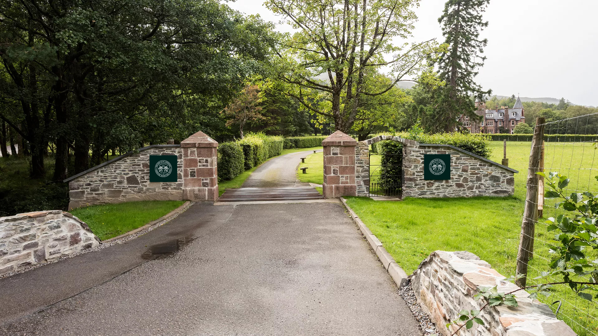
The logo takes inspiration from heritage gunmakers, balancing classic British craftsmanship with contemporary refinement. I anchored the identity with a crest-style emblem, depicting a poised spaniel within a traditional shield. This iconography visually echoes the core values of precision, tradition, and trust.
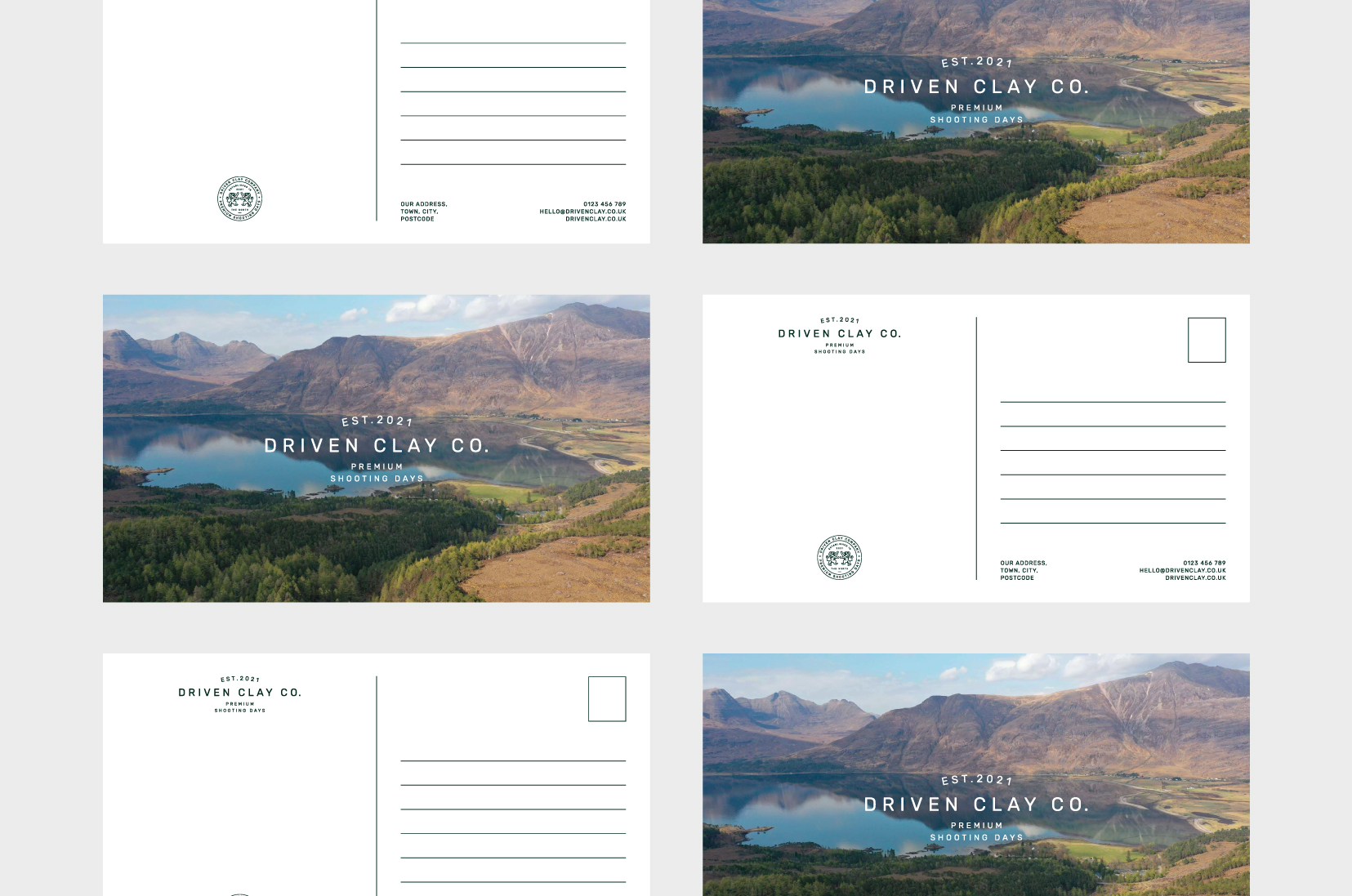

Typography was carefully chosen to express both sophistication and heritage. A classic serif wordmark lends the brand an assured and timeless quality, while supporting typefaces introduce modern contrast necessary for digital clarity.
The colour palette centres on rich gunmetal tones, deep forest greens, and muted golds. This selection is a deliberate nod to the rural landscape and the fine craftsmanship of sporting equipment.
Across all print and digital applications, the brand system I created conveys understated luxury. Subtle textures, fine lines, and generous spacing establish a consistent sense of confidence and composure.
My focus was ensuring each detail, from stationery to signage, reflects the same precision that defines every Driven experience-consistent, deliberate, and beautifully executed.