07 / 10
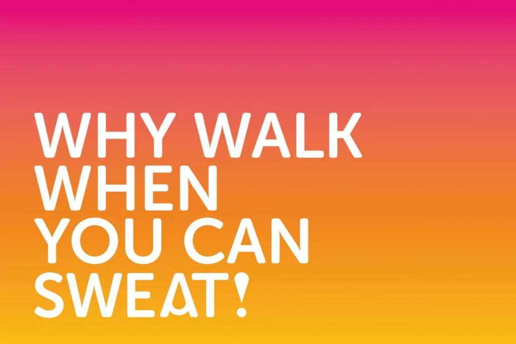
Why walk?
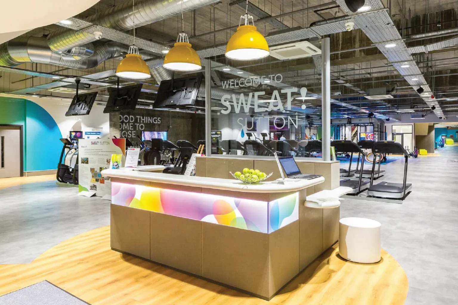
SWEAT! Gym is built for people at every stage of getting fit, including the very start. The brand had to be bright, friendly and hard to feel intimidated by.


It starts with the A. In the wordmark its counter is a drop of sweat – small, a bit cheeky, and strong enough to work as the symbol on its own, white on bright blue.
Around it is a palette that doesn’t hold back: lime, yellow, orange, pink, purple and blue, overlapping in soft shapes and running into gradients. Rounded capitals keep the type friendly, and a molecule pattern sits quietly behind it all.



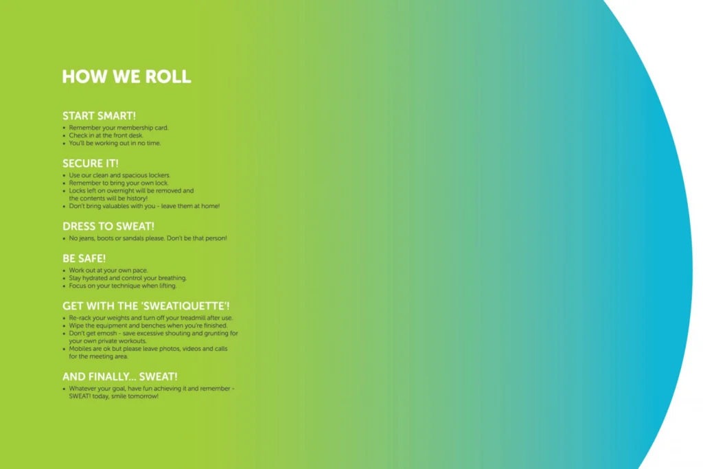
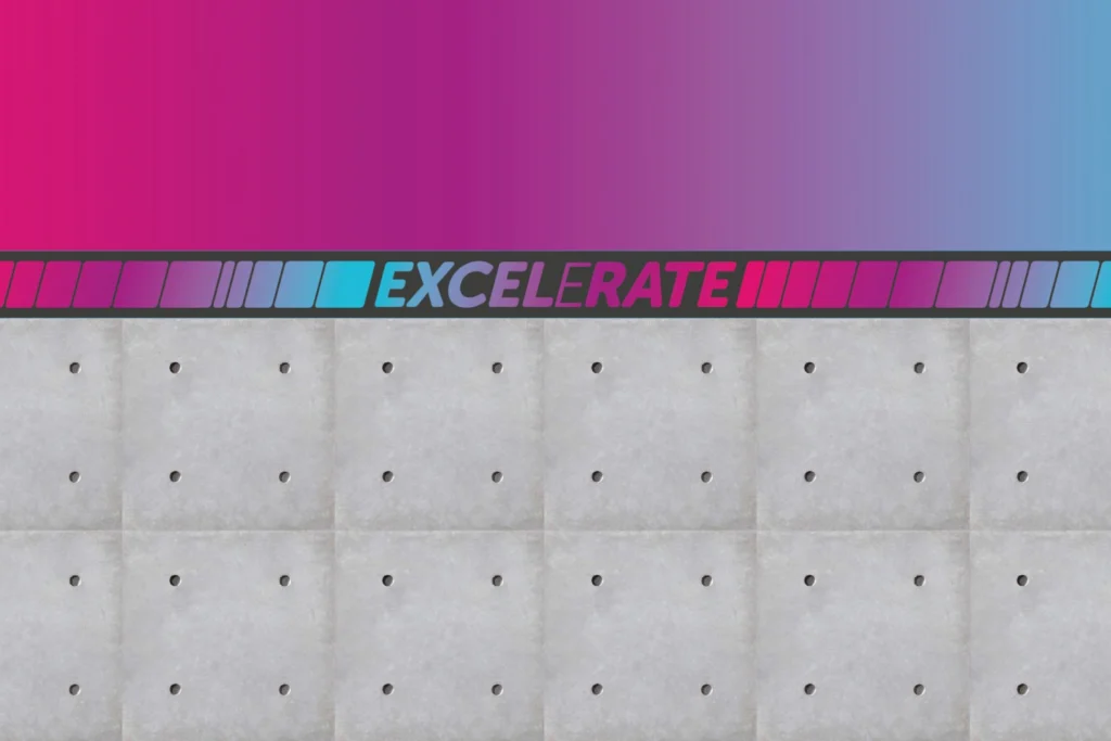
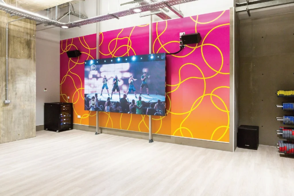
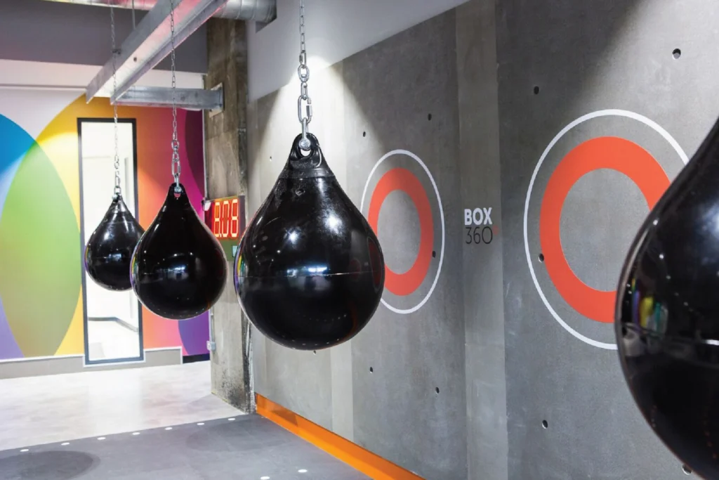
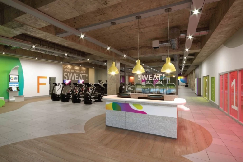
Most of the brand lives on the walls. The reception desk is wrapped in bubble graphics, with ‘Welcome to Sweat!’ on the glass. The studio has looping yellow lines around its big screen, the boxing area has orange rings and Box 360 signage, and ‘Excelerate’ runs in gradient letters along a dark band of wall. Even the house rules got a brand: ‘How We Roll’, from ‘Start smart!’ to ‘Dress to sweat!’

I designed and built the website with the same energy – bright photography, short lines that get people moving, and a layout that makes booking a class or signing up quick. A set of custom icons explains the classes and facilities at a glance, and a social media framework keeps every post looking like SWEAT! long after launch.