Neighbourhood Bar Branding
– Strategy
– Creative Direction
– Print Design
– Brand Identity
– Web Development
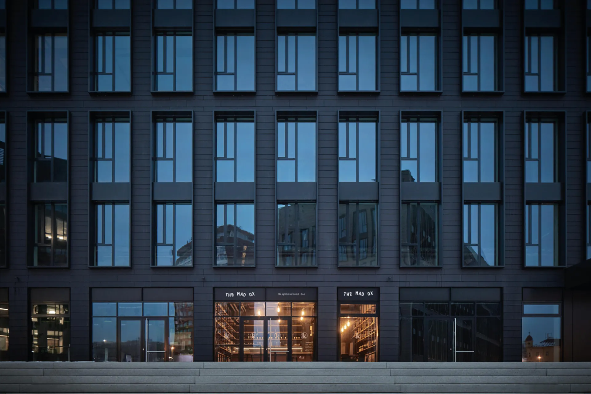
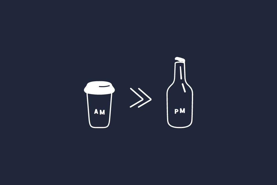
The Mad Ox is positioned as far more than a typical neighbourhood bar-it is intended to be a hub of community, defined by its bold and energetic personality.
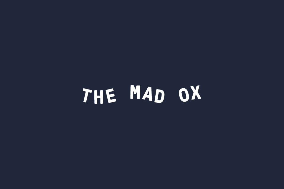
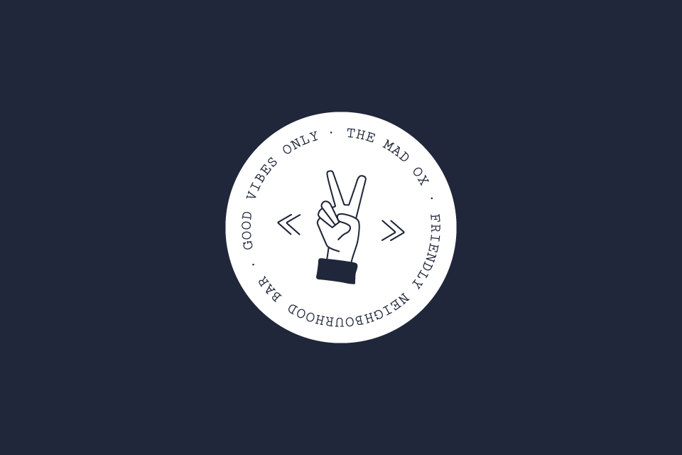
My goal was to craft a design strategy that embraced the name, ‘The Mad Ox,’ while establishing a warm, approachable tone that resonates equally with locals and newcomers. At the heart of the identity is a striking logo that successfully balances playfulness with necessary professionalism.
I crafted iconography that incorporates subtle, characterful nods to the bar’s name, creating a visual language that is immediately inviting and fun. This decision ensures the brand stands out in a crowded market by owning its distinct personality.
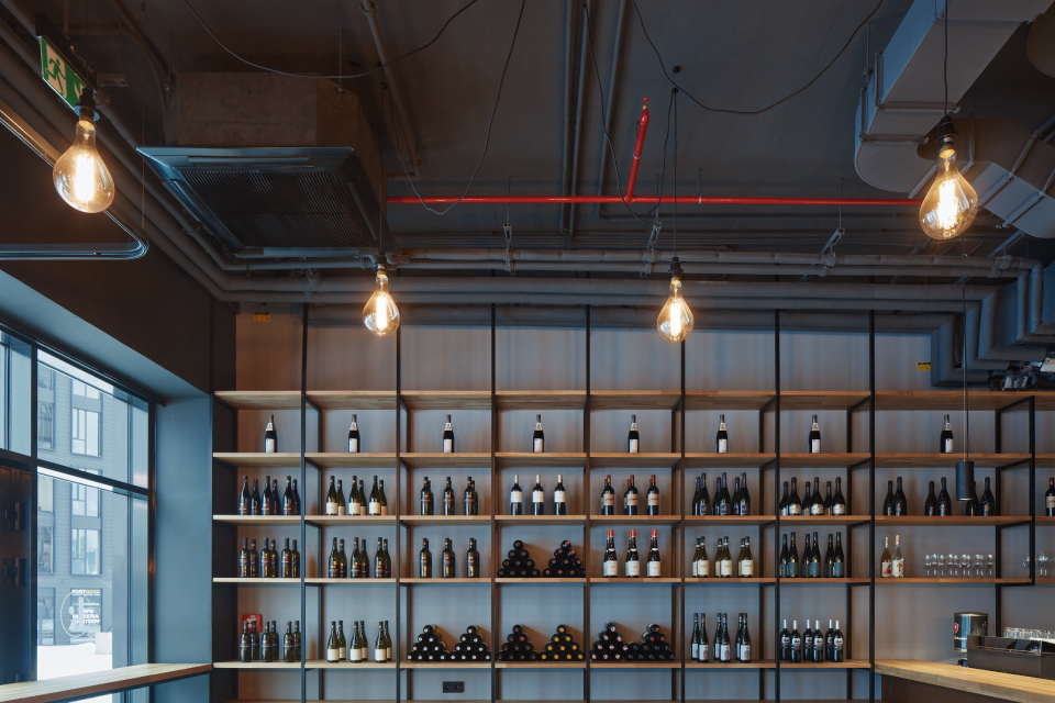
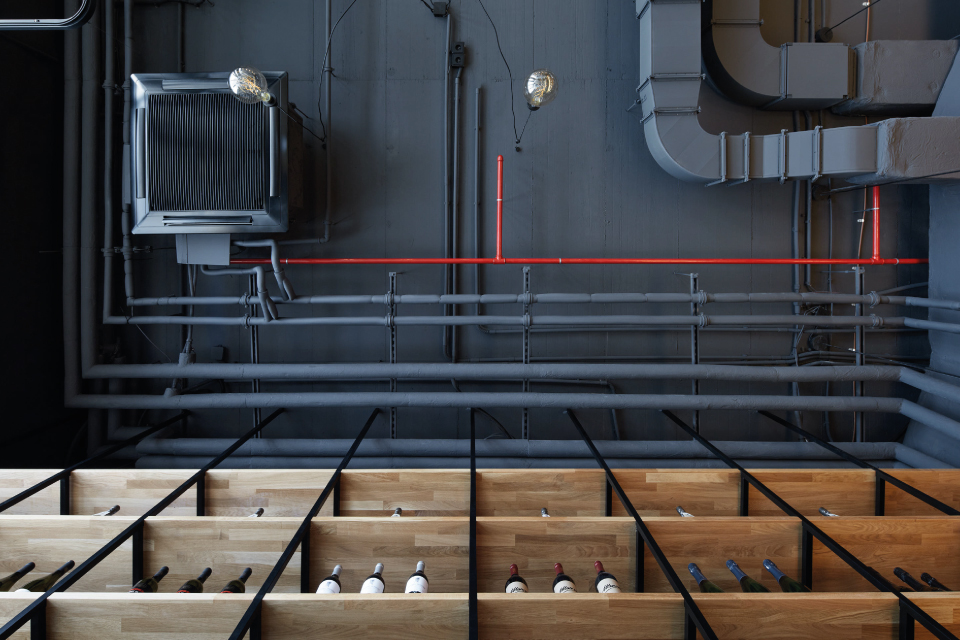
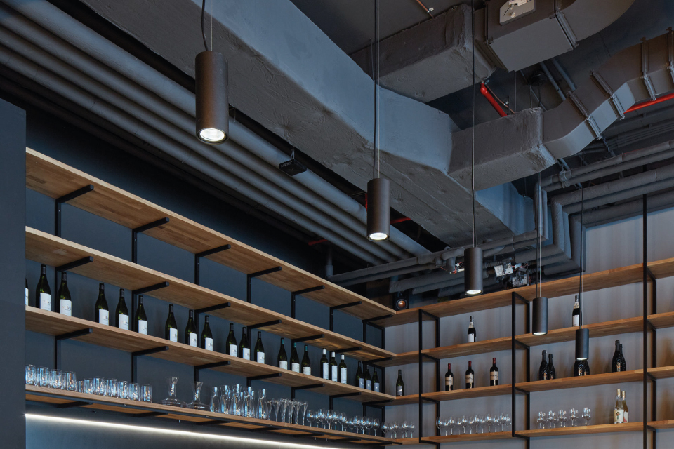
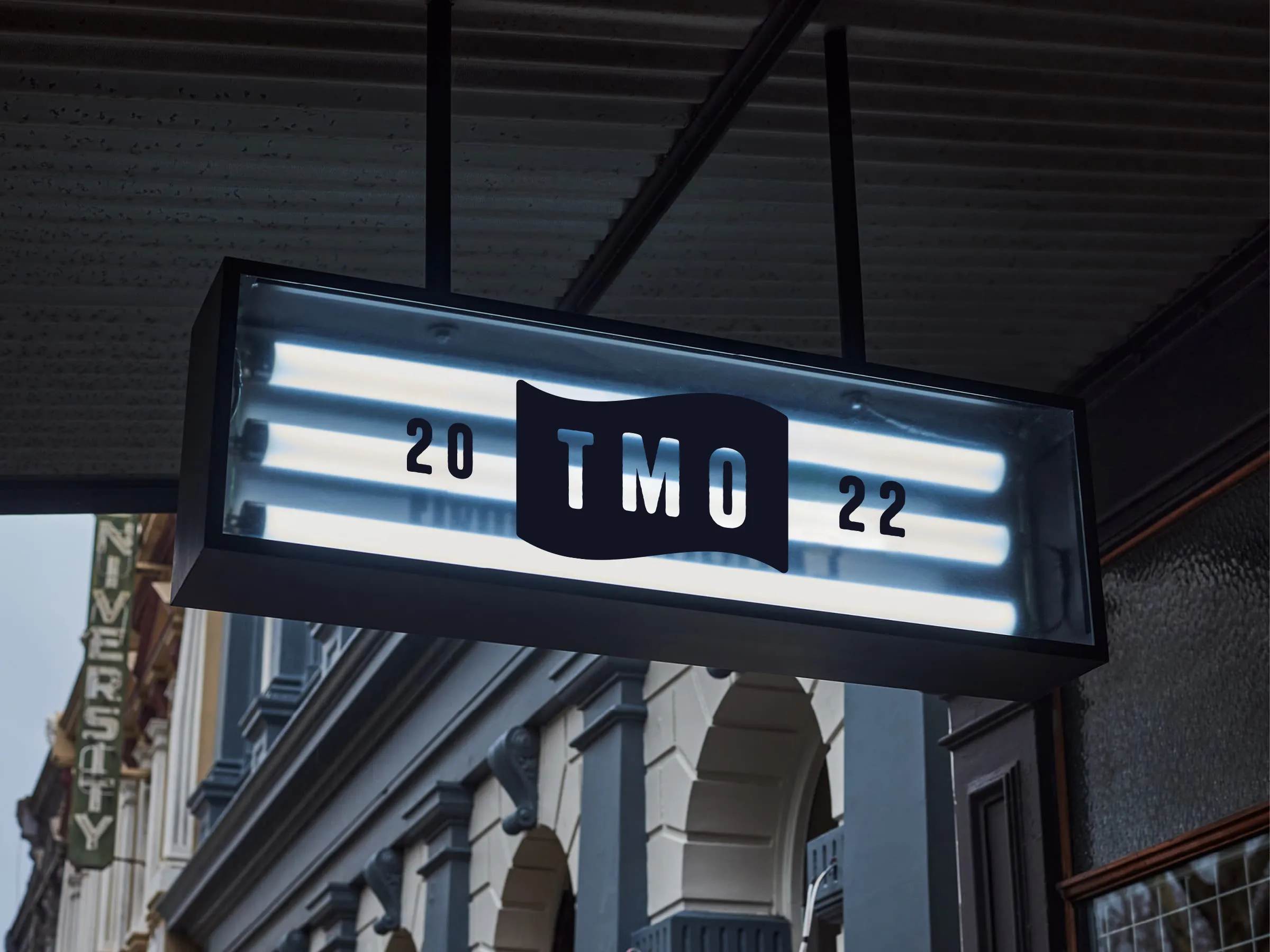
The visual language I established extends across all applications to create a cohesive experience. These design elements—from refined typography to the playful iconography—were integrated into print materials, including coasters and menus, and extended to interior graphics and wall art. This holistic approach guarantees that the brand’s dynamic atmosphere is felt consistently throughout the physical space.
The end result is a brand that feels as dynamic as the bar itself. The identity I designed ensures that The Mad Ox stands out as a community favourite, supported by a fresh, modern aesthetic and an unforgettable atmosphere.

The end result is a brand that feels as dynamic as the bar itself—a place where people come for great drinks and stay for the unforgettable atmosphere. The Mad Ox now stands out as a community favourite with a fresh, modern identity.