06 / 10
Built on a grid
Laser Construction manage and deliver building projects, working with a trusted chain of supply partners. Their reputation rests on precision and reliability, so the brand had to be the same: straight lines, no surprises.
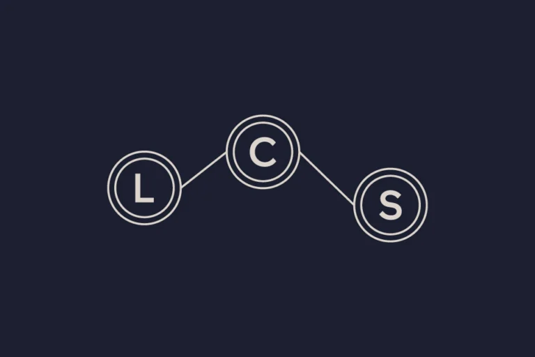
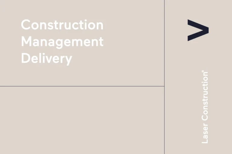
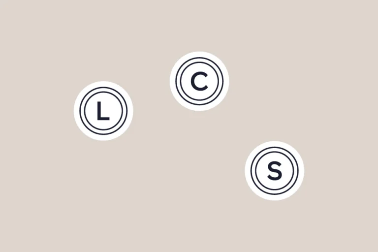
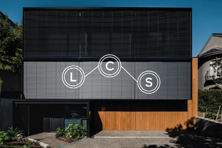
The monogram links L, C and S in three double-ringed circles, and each letter can stand alone as its own roundel. The wordmark is set in Maax and runs vertically when the space calls for it – up the side of a van or down the edge of a page.
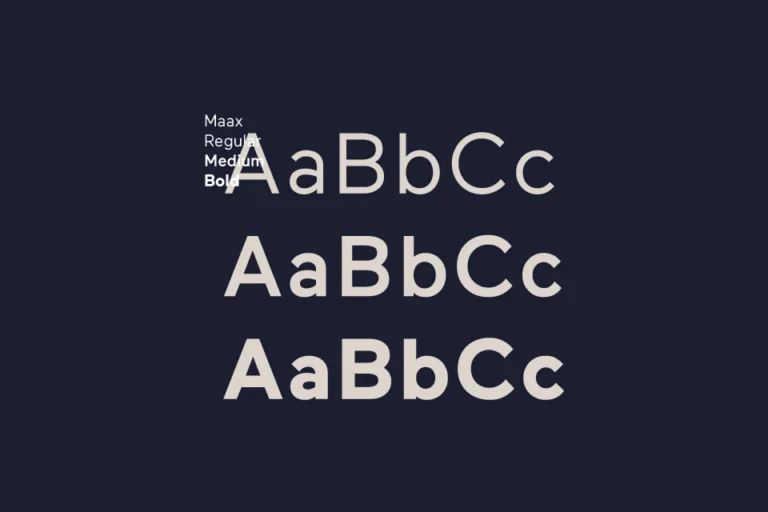
Maax comes in regular, medium and bold, which is all the range it needs. The palette is navy and a warm stone – the stone for the material they build with. It feels solid without feeling heavy.
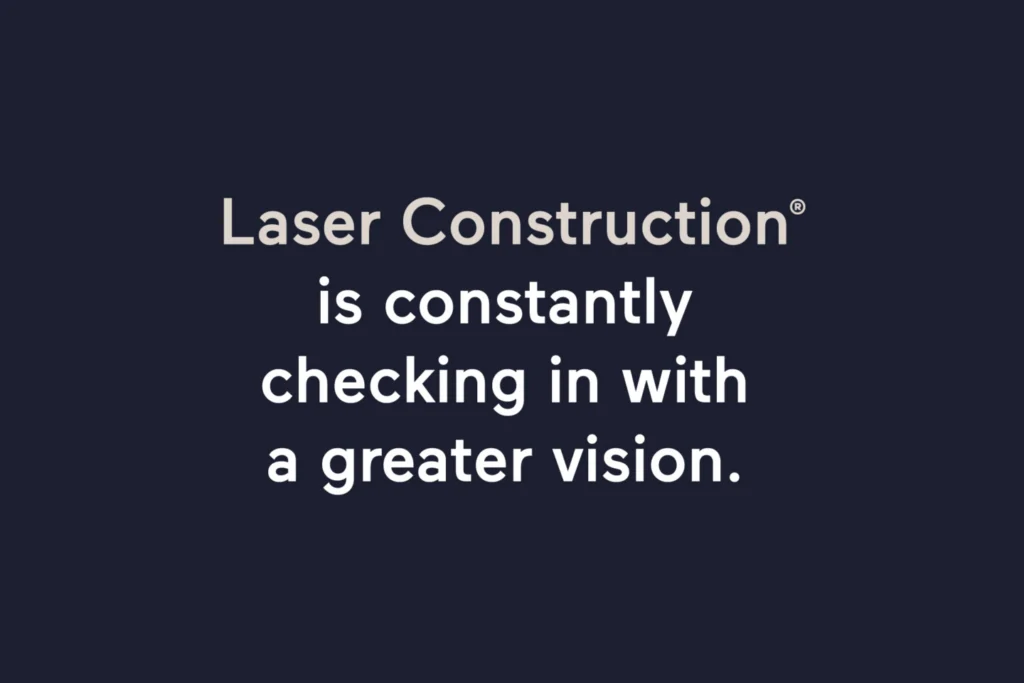
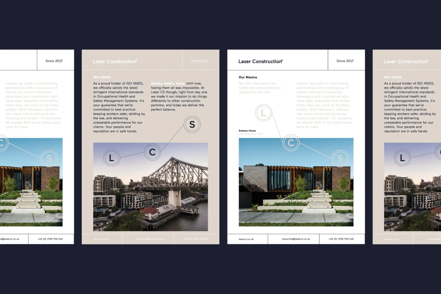
Layouts sit on a strict grid, with a navy chevron for direction. The brochure puts ISO 45001 alongside photography of finished work – a timber-clad house behind louvred screens, a dining room with a curved leather banquette. Lines like ‘is constantly checking in with a greater vision’ give it a voice beyond the spec sheet.
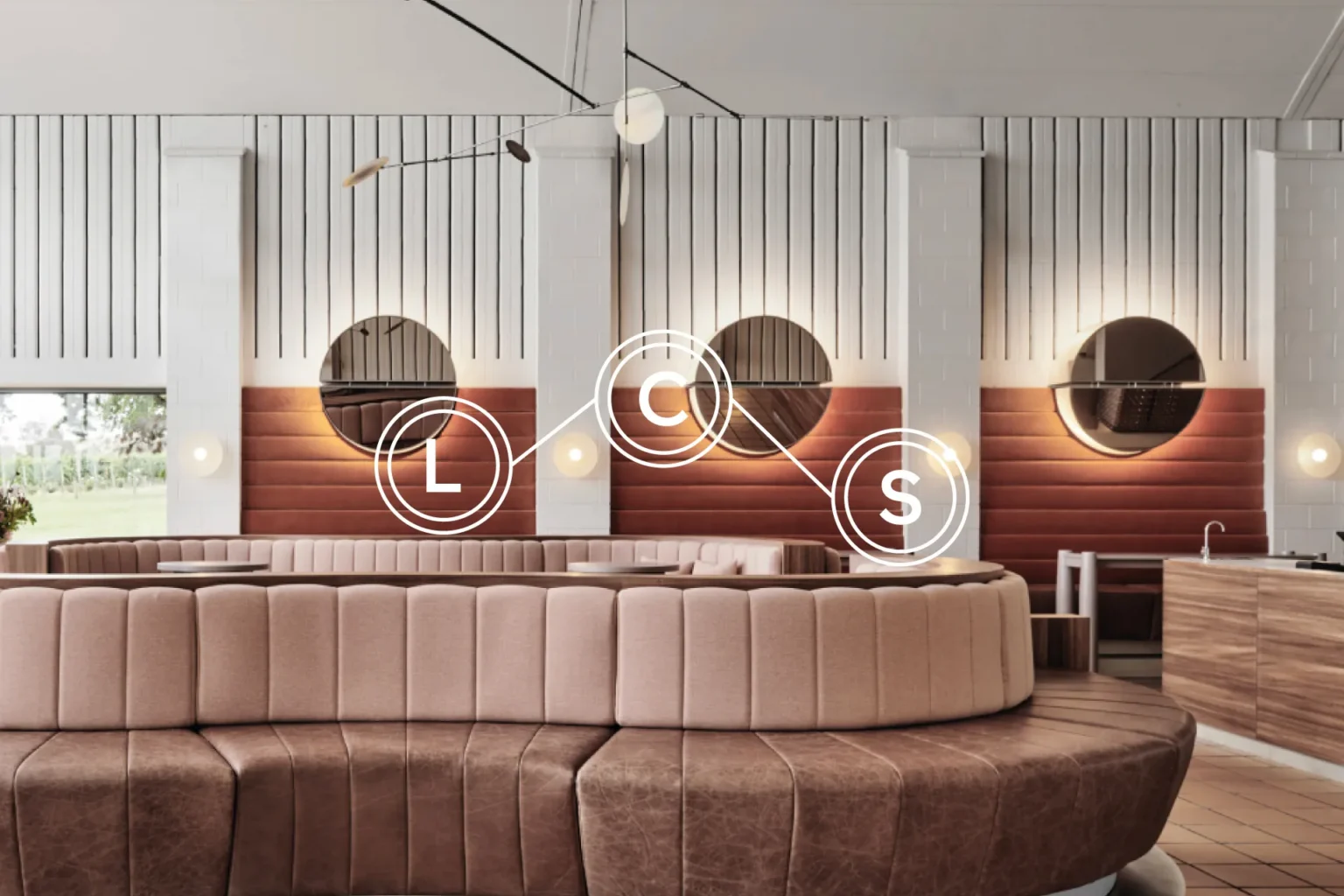
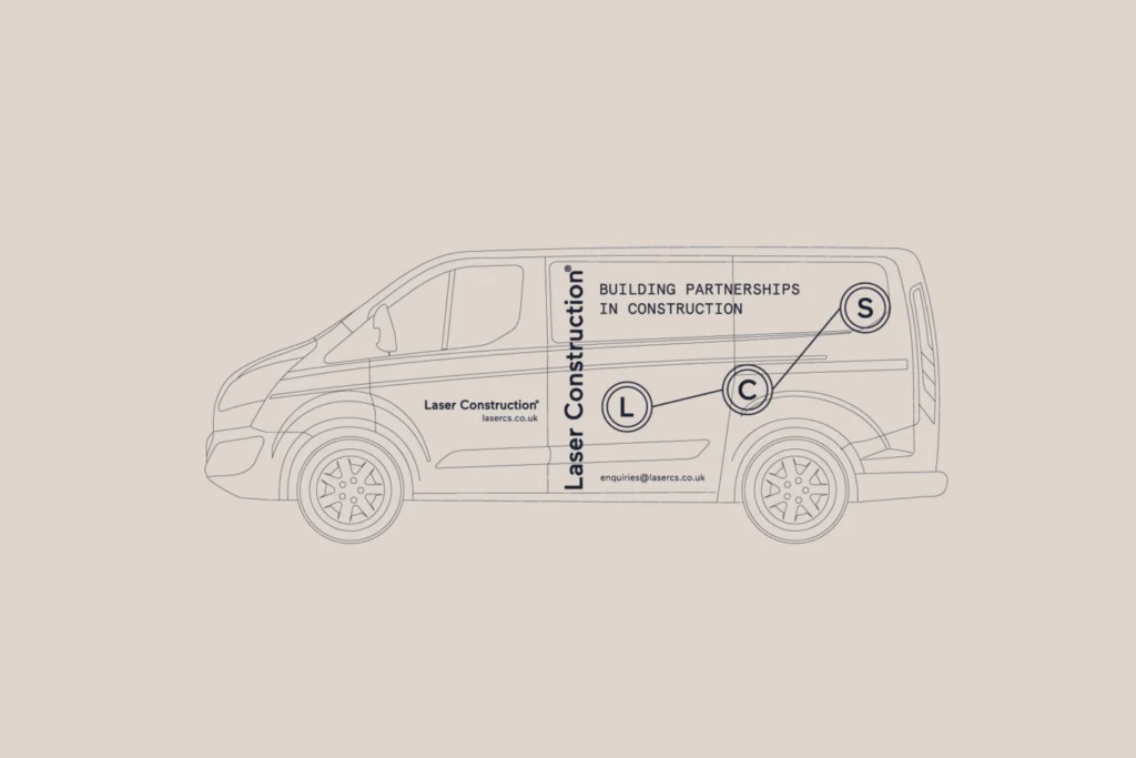
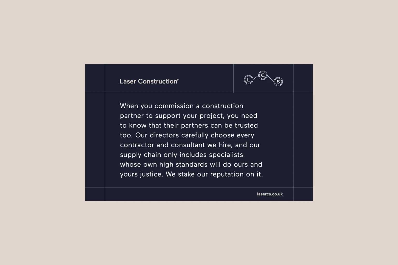
The van says ‘Building partnerships in construction’, and the rest of the identity backs it up: a few pieces, used the same way every time. A navy card explains how they work with their supply chain partners in a single paragraph – the brand doing its job in plain English. I designed and built their website as well, with the same type, palette and monogram, so the brand held together online too. It’s a brand that would rather be trusted than noticed – though it turns out it can be both.