05 / 10
A brand for the people who brand shops
Retail Creations make and install the graphics and signage in shops and offices. They spend their days making other businesses look good, so their own brand was always going to get a hard look.

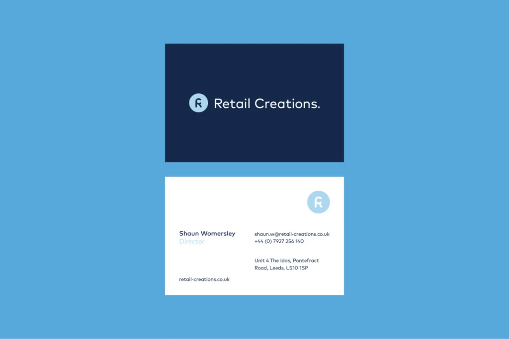

The rebrand starts with a single letter. A circular R brandmark sits beside the wordmark, light blue on navy, and holds its own as a roundel on business cards and badges. It comes in five blues, from pale to navy.
Retail Creations do a lot of different things, which is hard to explain in one sentence. So I drew a set of icons, one for each service, that does the explaining before anyone reads a word.
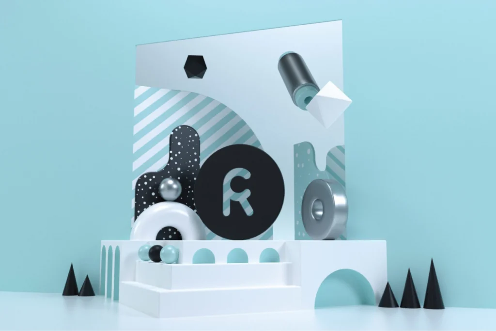
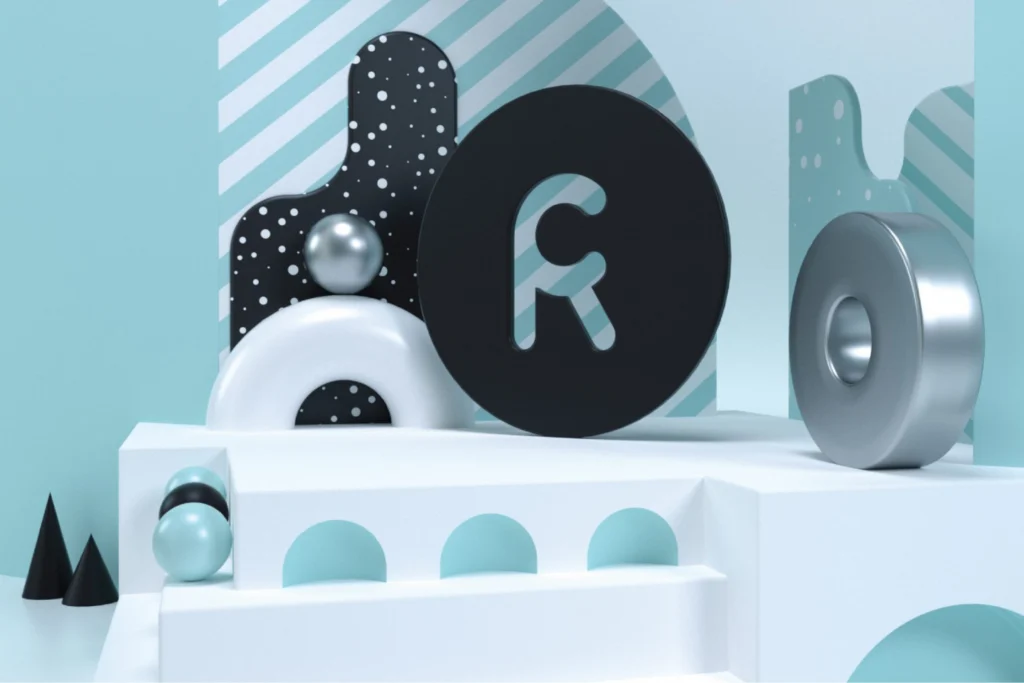

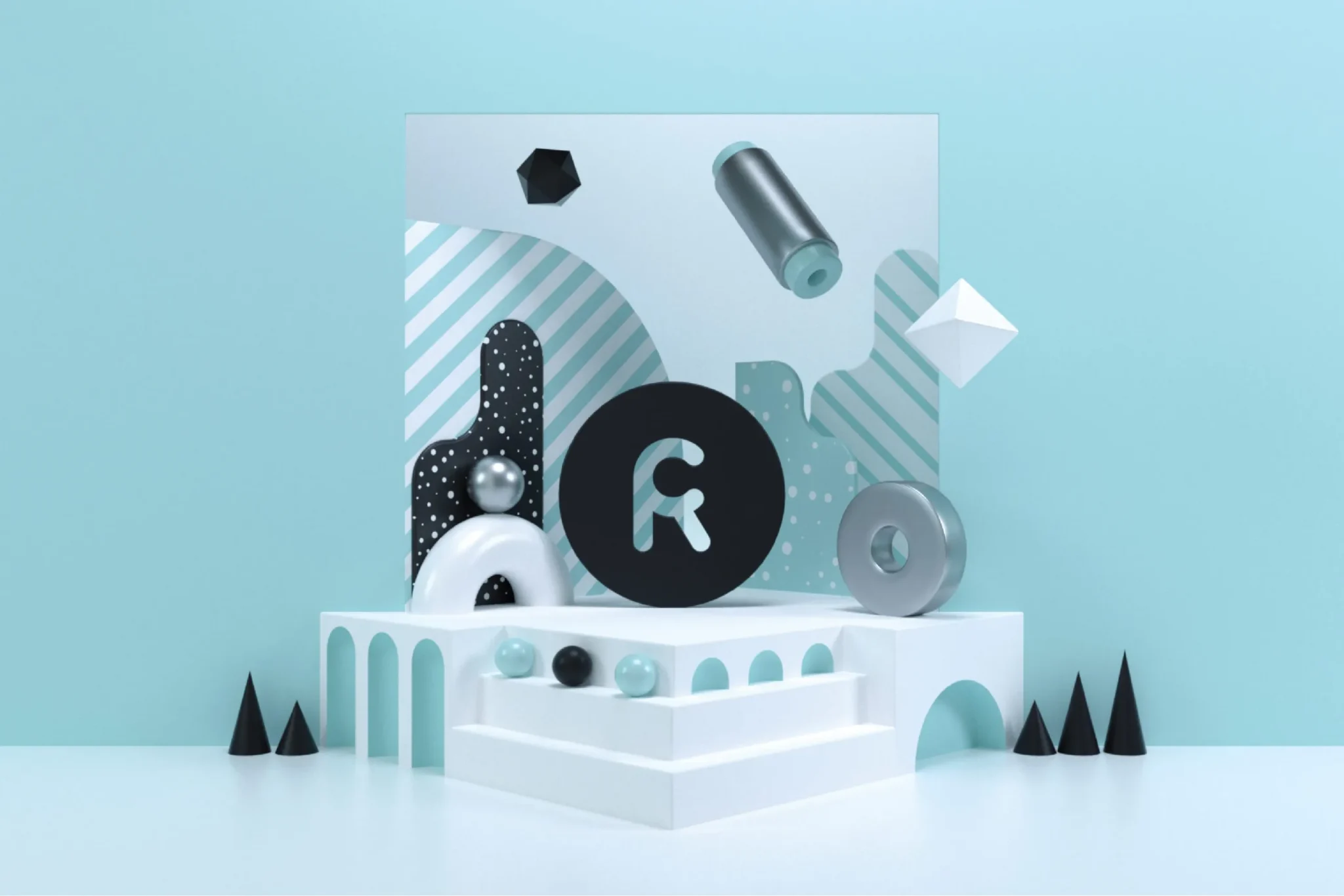
The brandmark also lives in a small 3D scene: white steps and arches, cones, spheres and a silver ring, with the R on a black disc at the centre. It’s a nod to what they actually do – put graphics into real spaces.
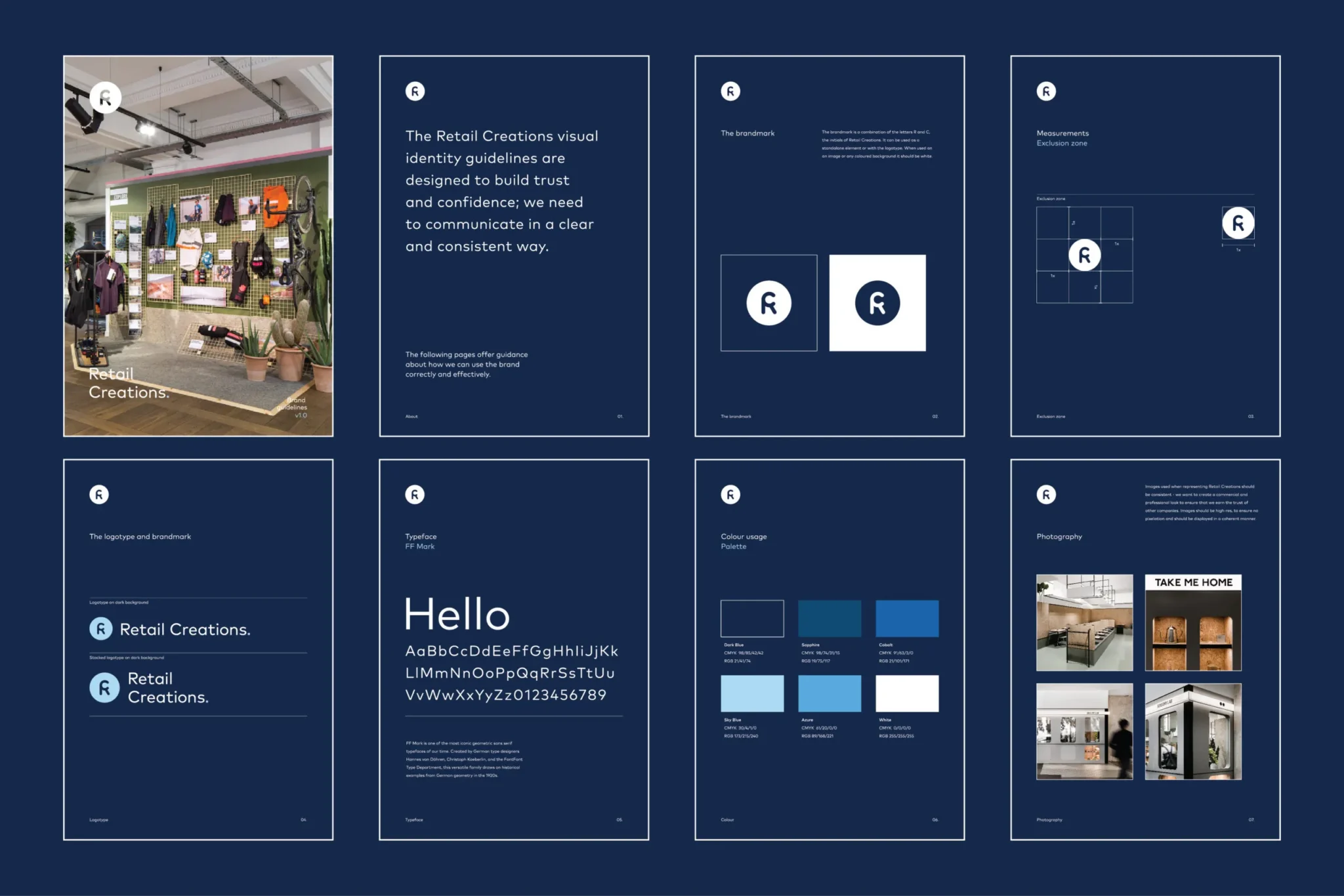
All of it is written down in the brand guidelines, from the space around the brandmark to type, colour and photography, so whoever picks it up next uses it the same way.
I designed and built the new website too. It’s an information hub and a portfolio in one: photography of finished installations up front, and every service a click away. A client should know what Retail Creations can do within a couple of scrolls – and see that they’ve already done it for someone else.