02 / 10
Consultancy, minus the frills
RML Services advise on property development, cost, design, planning and construction. Before drawing anything, I worked with the founder, Richard, to pin down what the firm stands for: trust, clarity and no wasted words. The brand had to say exactly that, with nothing extra.
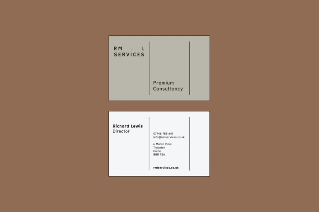
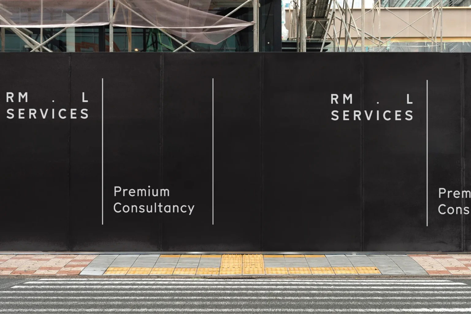
So the identity is mostly type. ‘RM . L’ is spaced out above ‘Services’ in plain capitals, with the full stop doing the job a symbol normally would. Beneath it sits one short line, ‘Premium Consultancy’, framed by fine black rules.
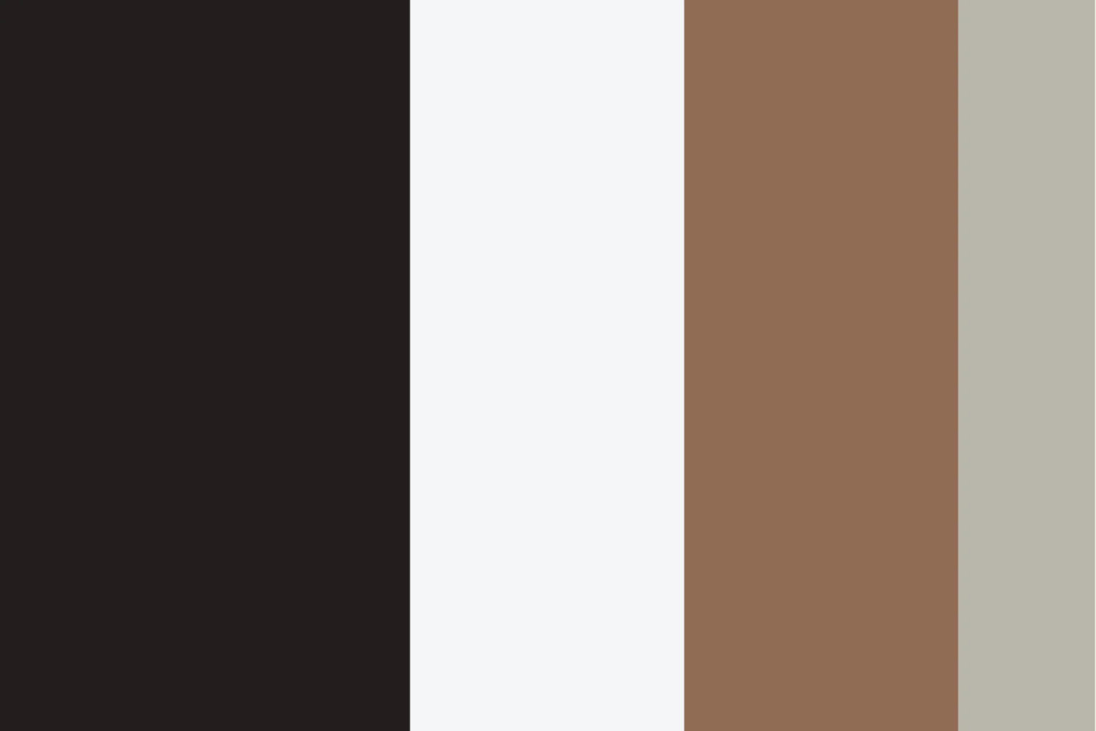
The palette is near-black, off-white, a warm brown and a stone grey – the brown and stone bring some warmth to all that black and white.
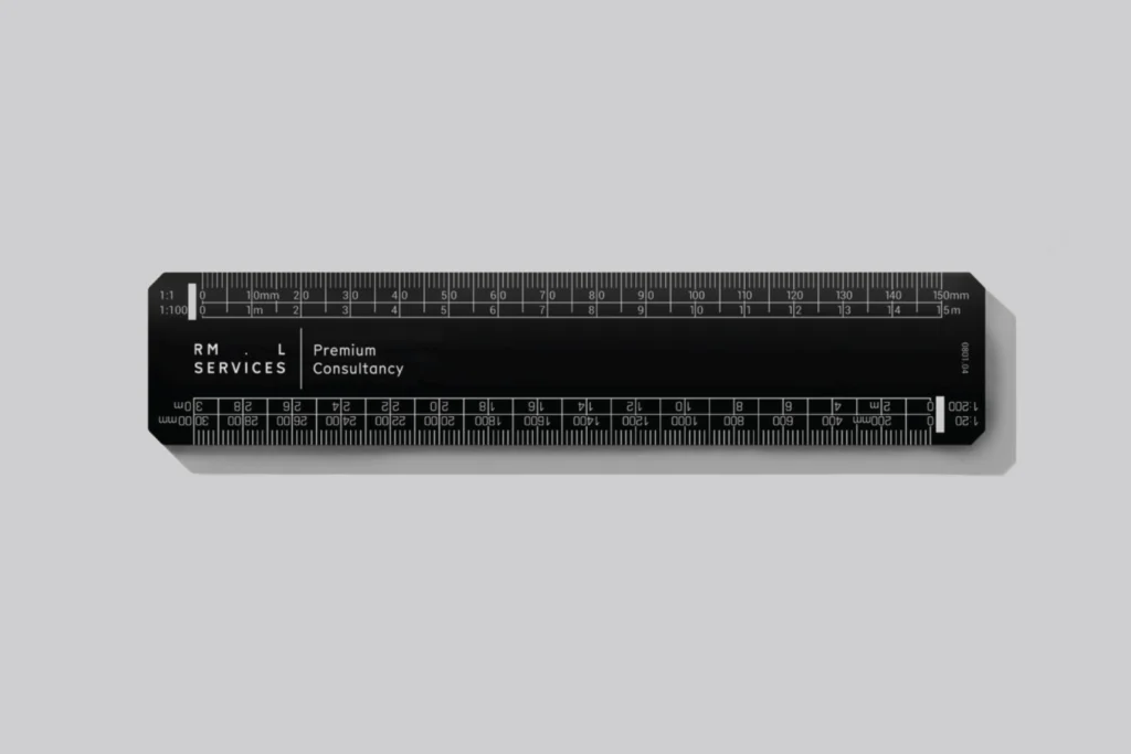
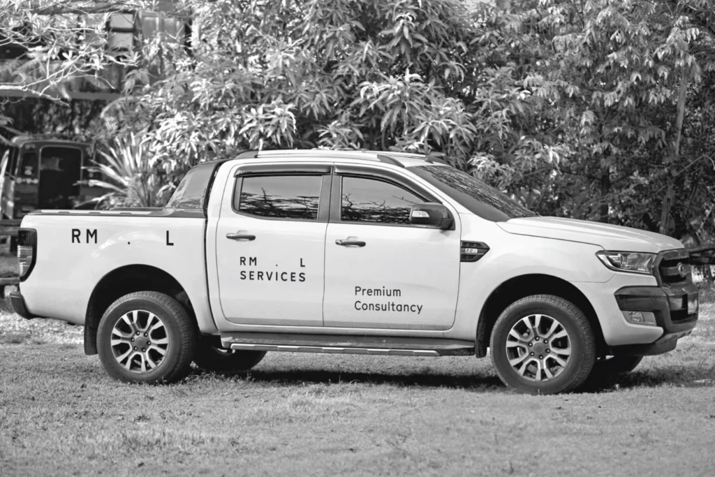
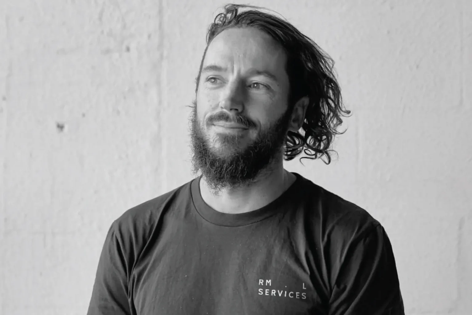
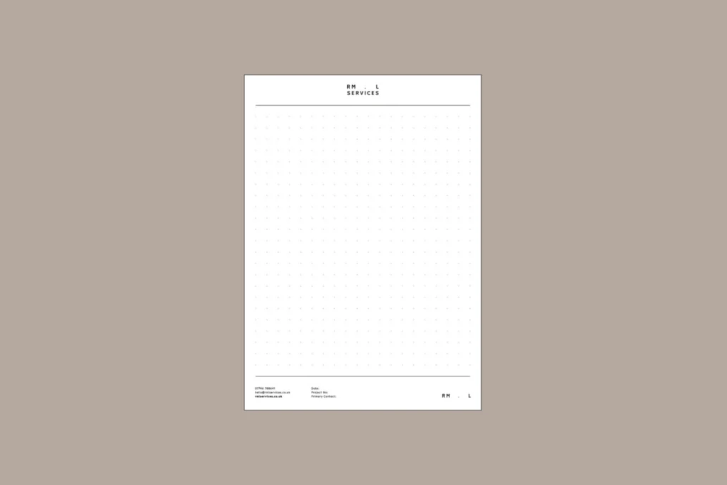
It’s made for the places RML actually turn up: a black hoarding around a building site, livery on a white pickup, and a branded scale ruler – possibly the most useful thing I’ve ever put a logo on. There are business cards, dot-grid notepads and t-shirts too, all kept in black and white so nothing competes with the wordmark.
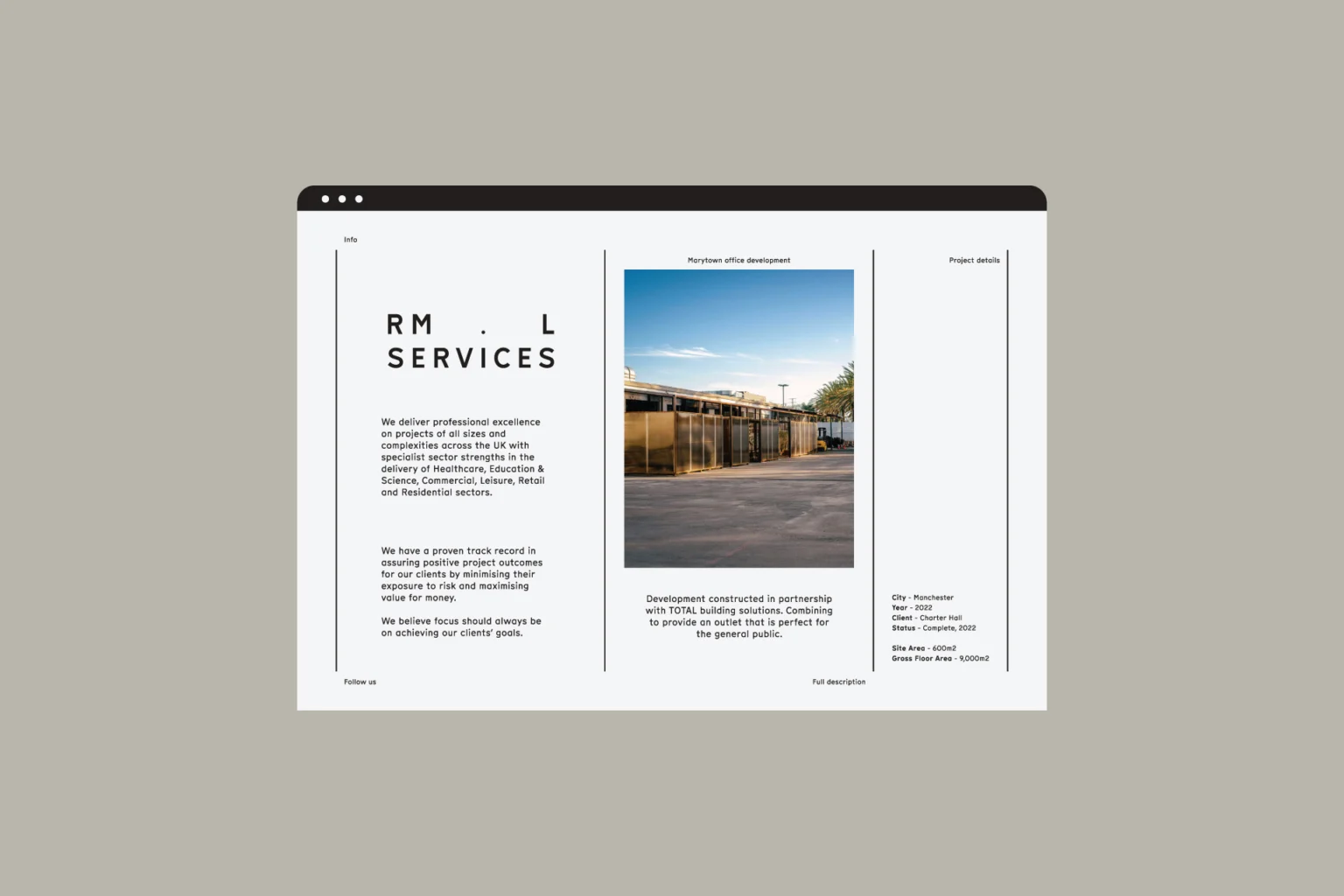
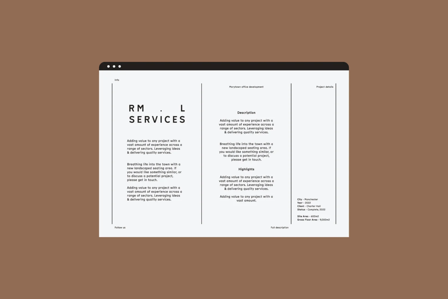
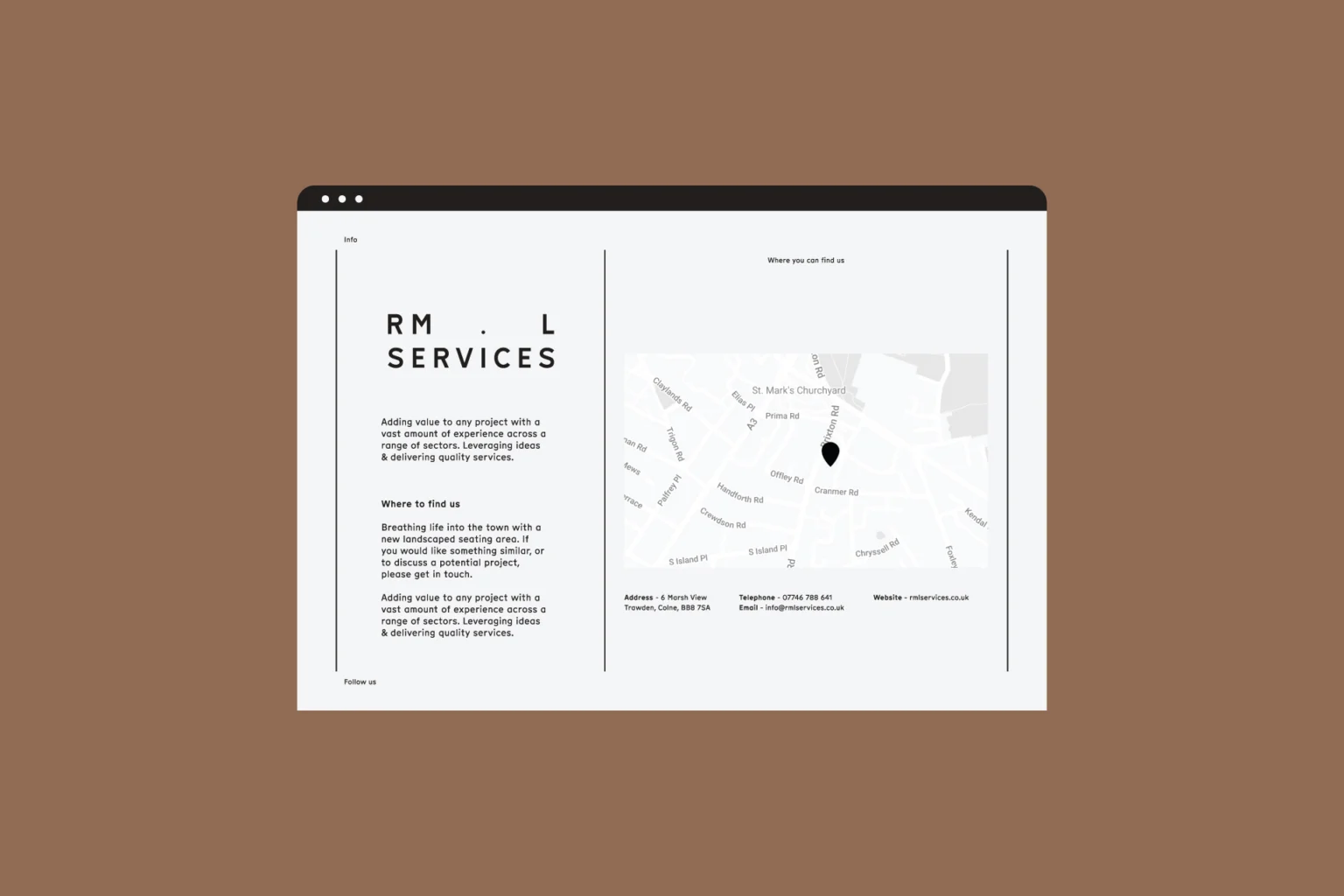
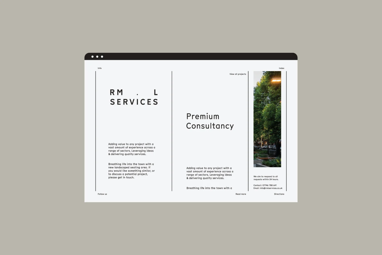
I designed and built the website to match: a homepage with ‘Premium Consultancy’ over a tree-lined street, project pages that lead with photos and the facts, and a contact page with a map. Short sentences, a clear order and nothing to wade through. Visitors get what RML do, and how well they do it, in a few seconds.