10 / 10
Mud, gravel and a dot grid
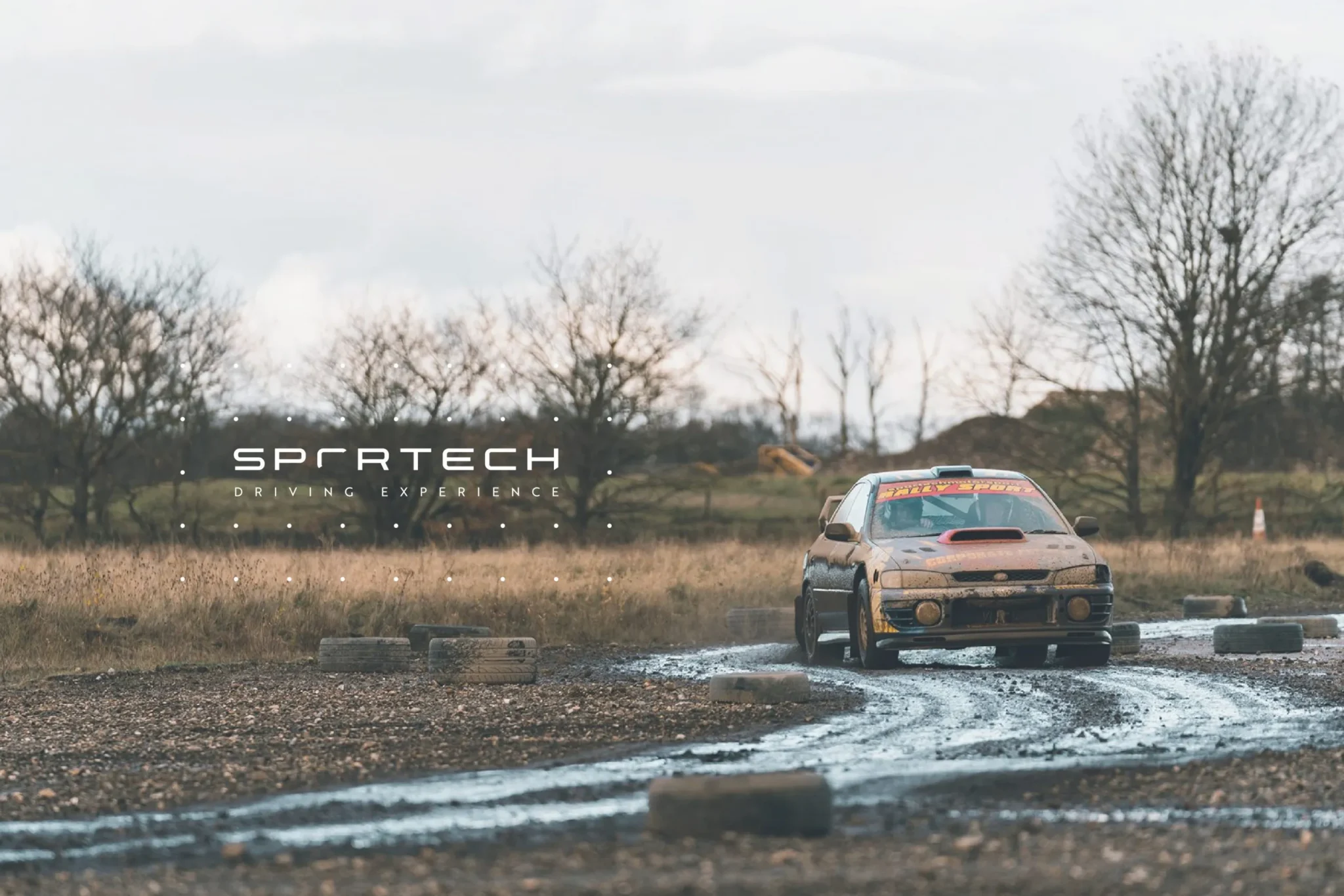
Sportech Motorsport puts people behind the wheel of a rally car – helmet on, harness tight, gravel everywhere. The brand had to carry the thrill of the day and still look polished enough for a premium experience.
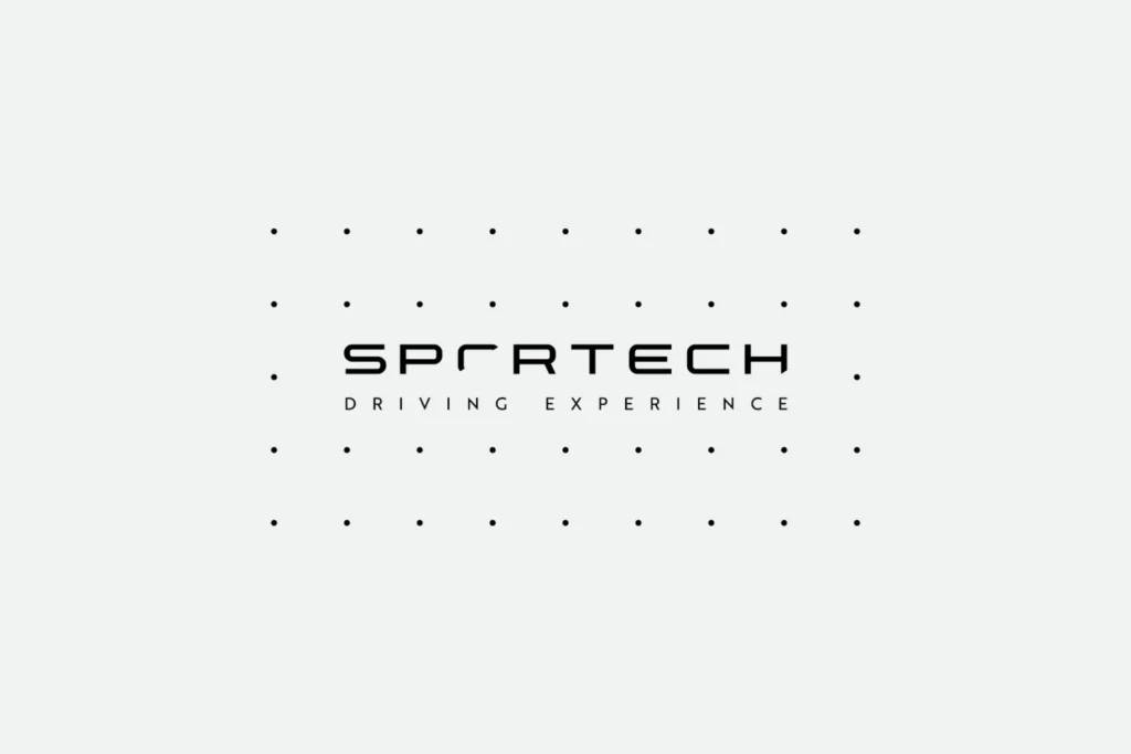
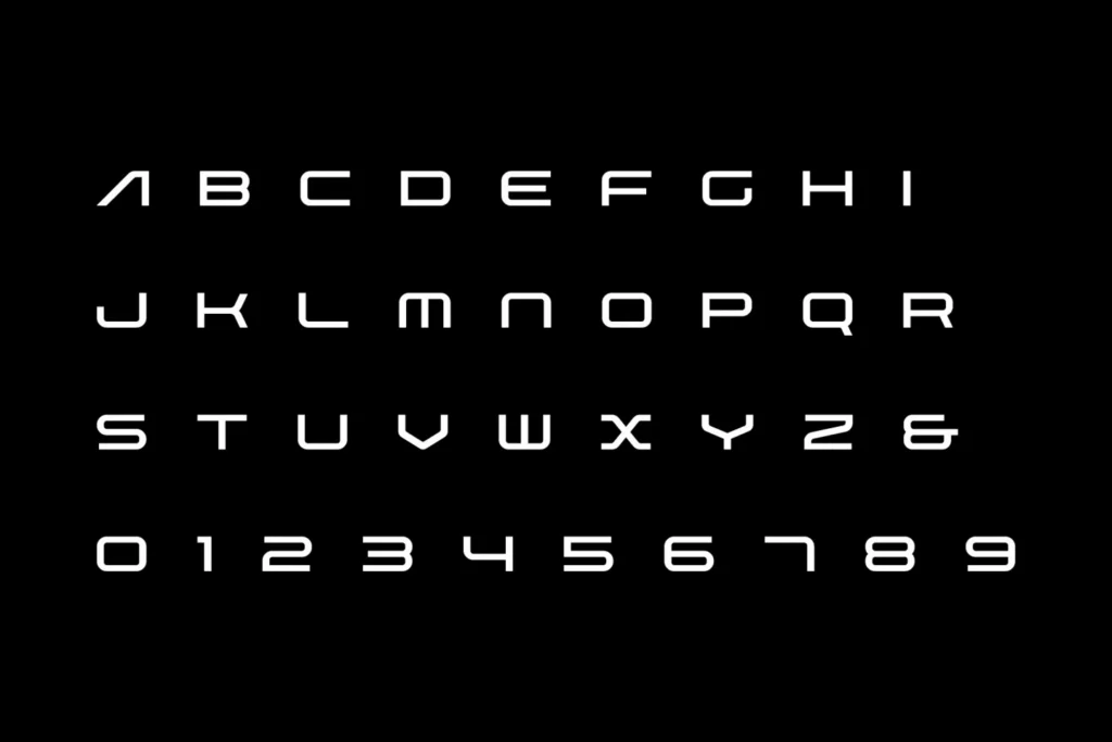
The logo is plain and quick to read: the Sportech Driving Experience wordmark, framed by a grid of small dots that feels a bit like a timing board. A brand typeface, with a full set of letters and numerals, keeps everything else in line.
The details are kept clean on purpose. When the cars are covered in mud, the type doesn’t need to be.
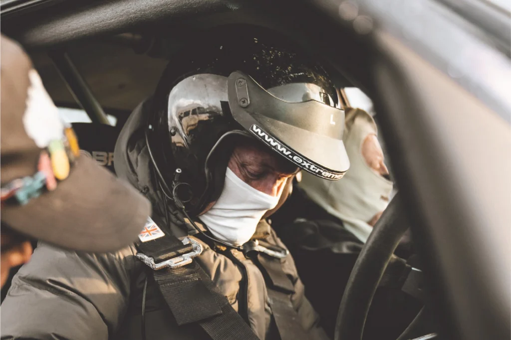
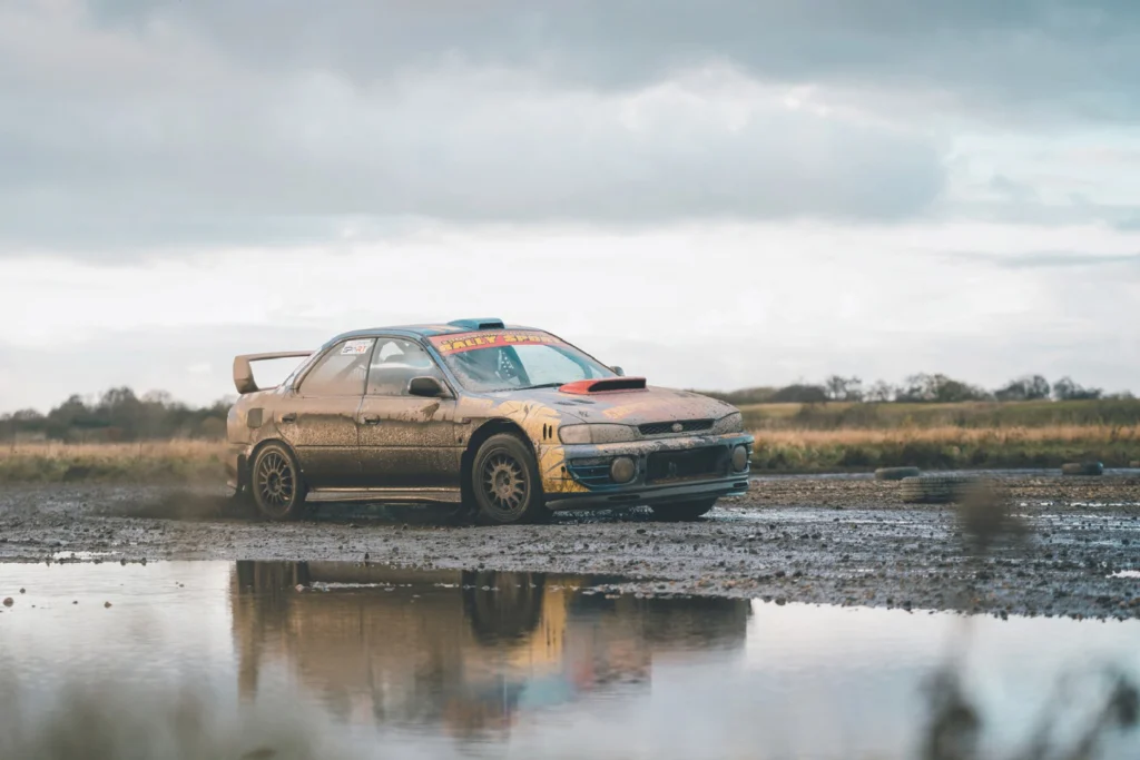
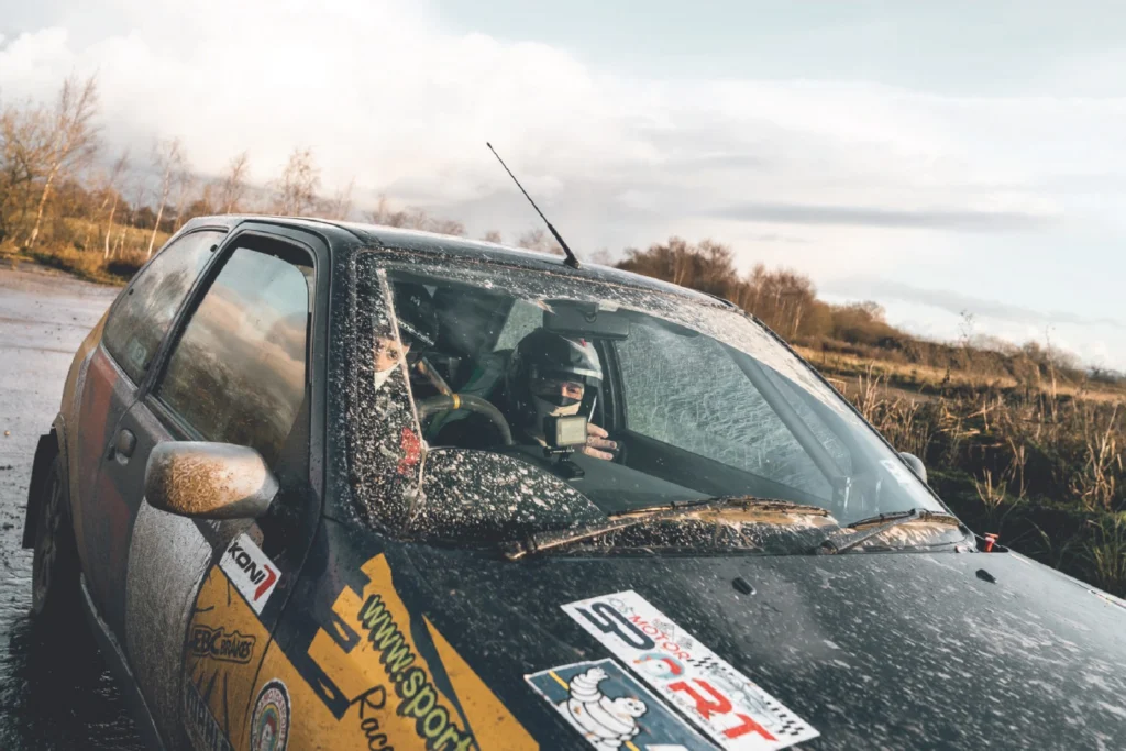
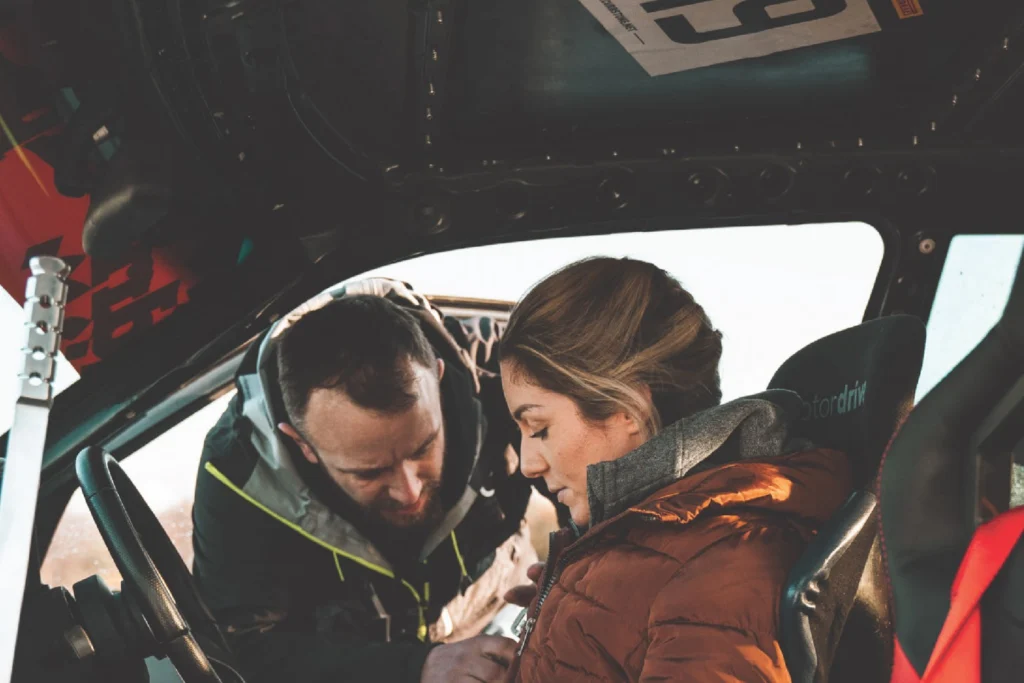

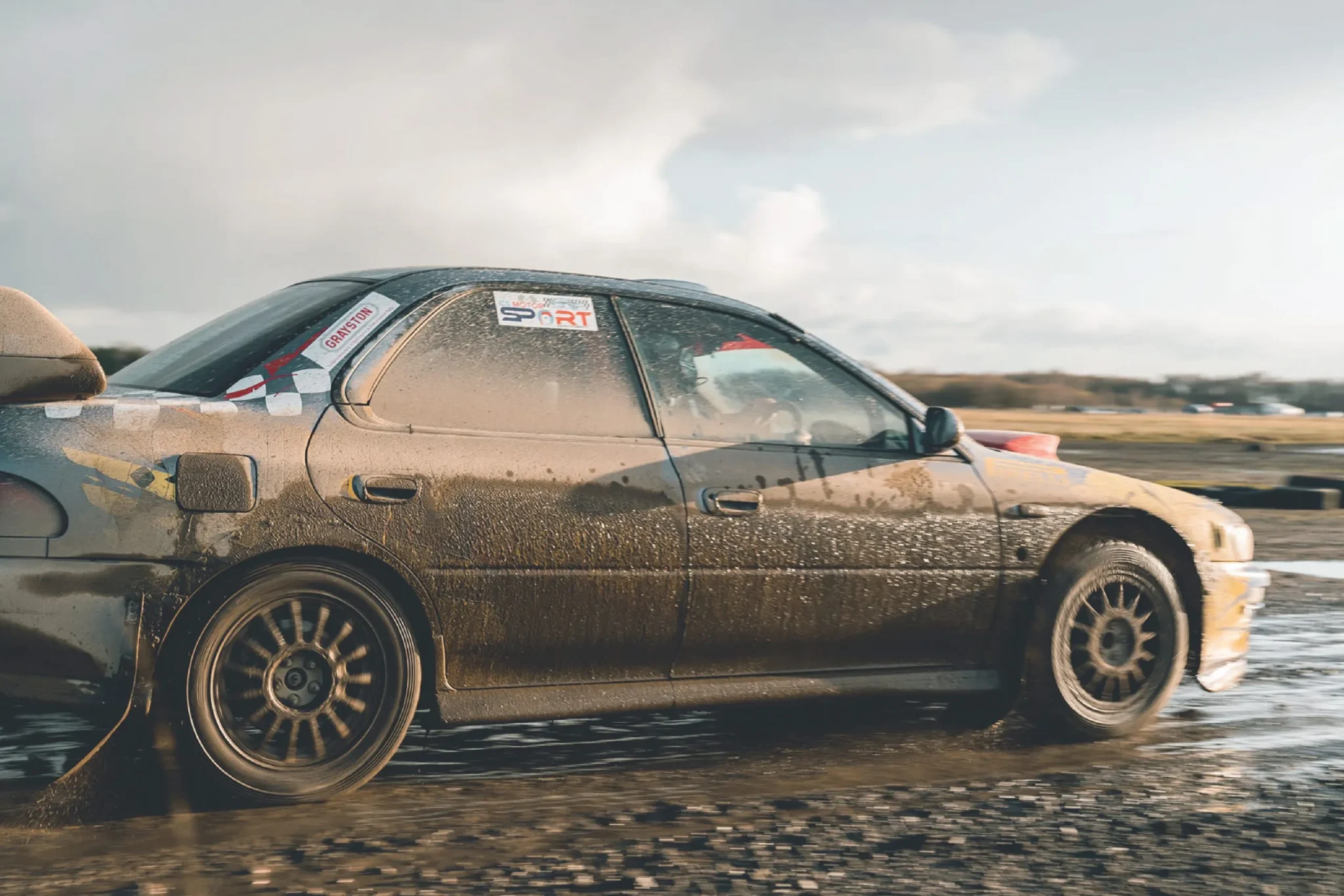
Photography does most of the work. Rally cars caked in mud on wet gravel, spray coming off the puddles, and the moments in between – someone leaning in to check a harness, a camera fixed behind the windscreen. It shows exactly what you’re booking, which sells it better than any adjective could.
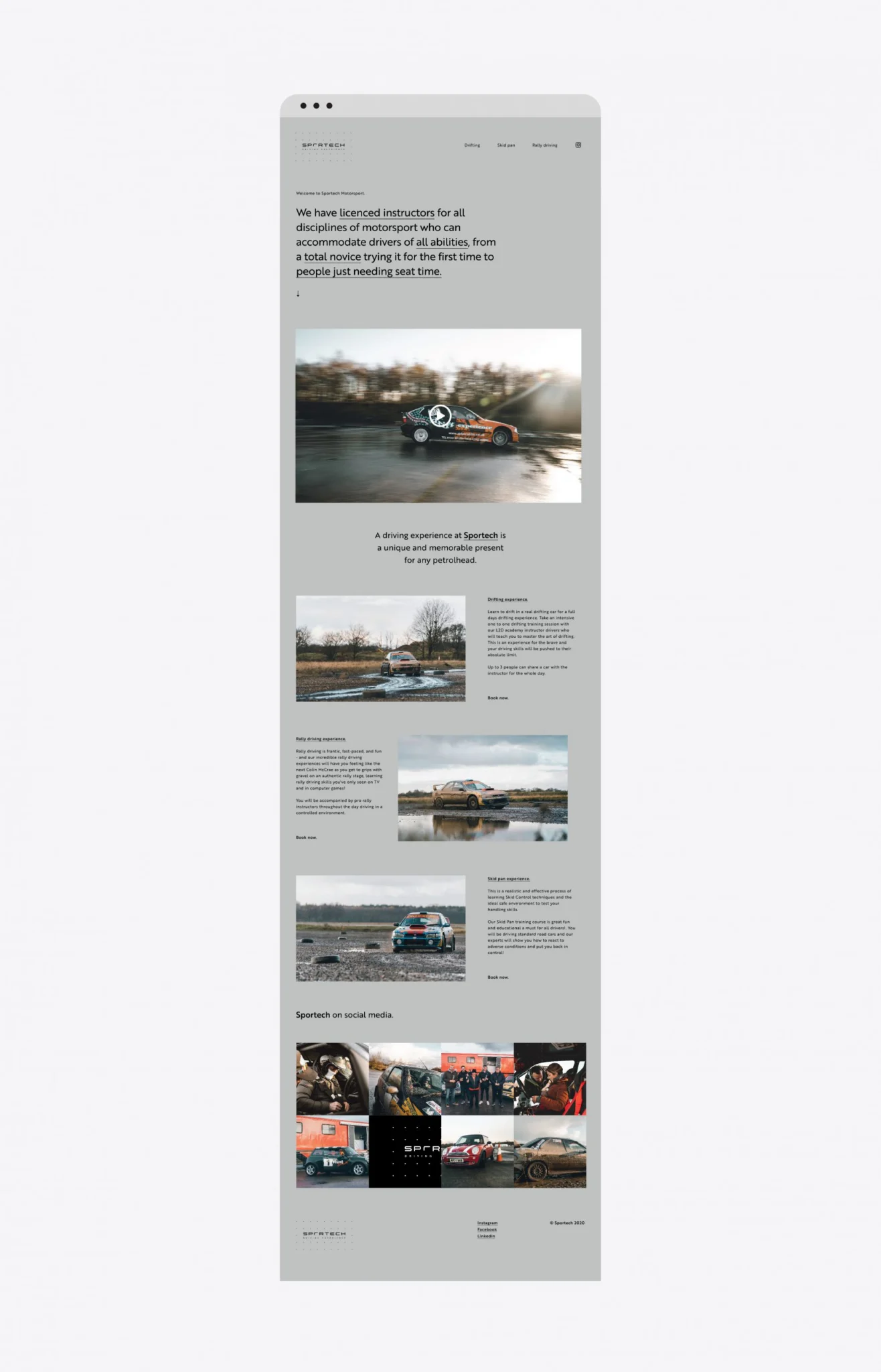
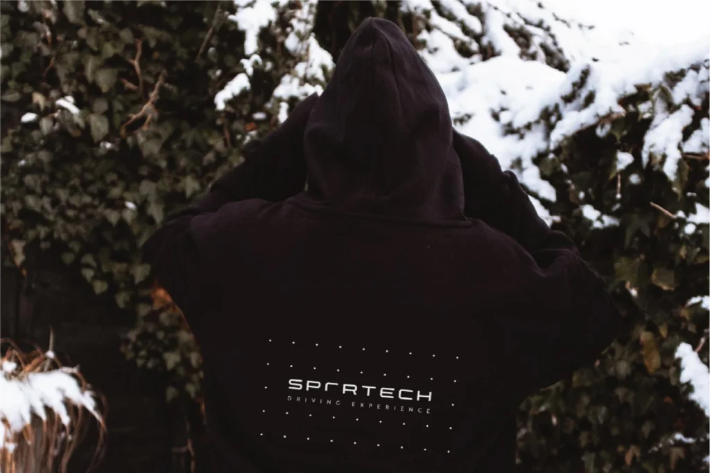
I designed and built the website around that photography, with the driving experiences laid out clearly and a booking route that doesn’t get in the way. The homepage leads with the rally photos and ends with a social grid, so it never looks out of date. The same logo and dot grid run onto the merch – a small chest logo on a black hoodie, the full lockup across the back – so the brand leaves the track too.