01 / 10
Made by hand, set in serif
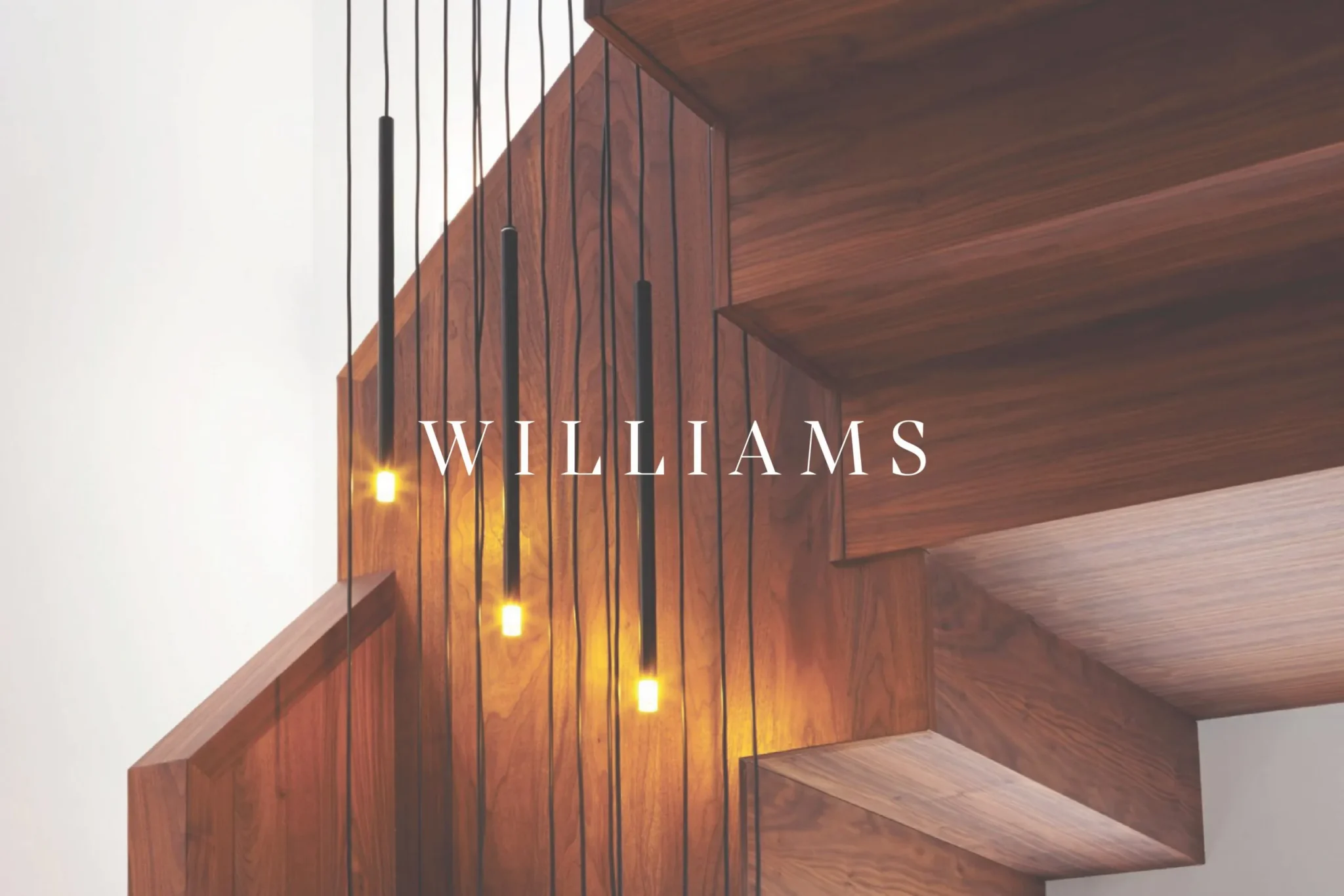
Williams Joinery makes staircases, cabinetry and furniture by hand, with skills passed down through generations. The work was already beautiful. The brand needed to catch up.
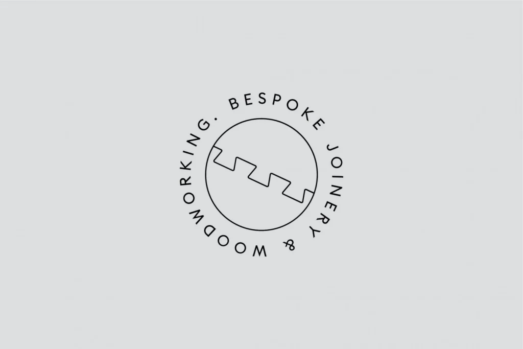
The wordmark is a serif in widely spaced capitals – closer to lettering cut into a brass plate than anything printed on a flyer. Beside it sits a roundel: a line drawing of an interlocking joint, ringed by ‘Bespoke joinery & woodworking’. It works as a stamp, a sticker or a badge on the back of a van.
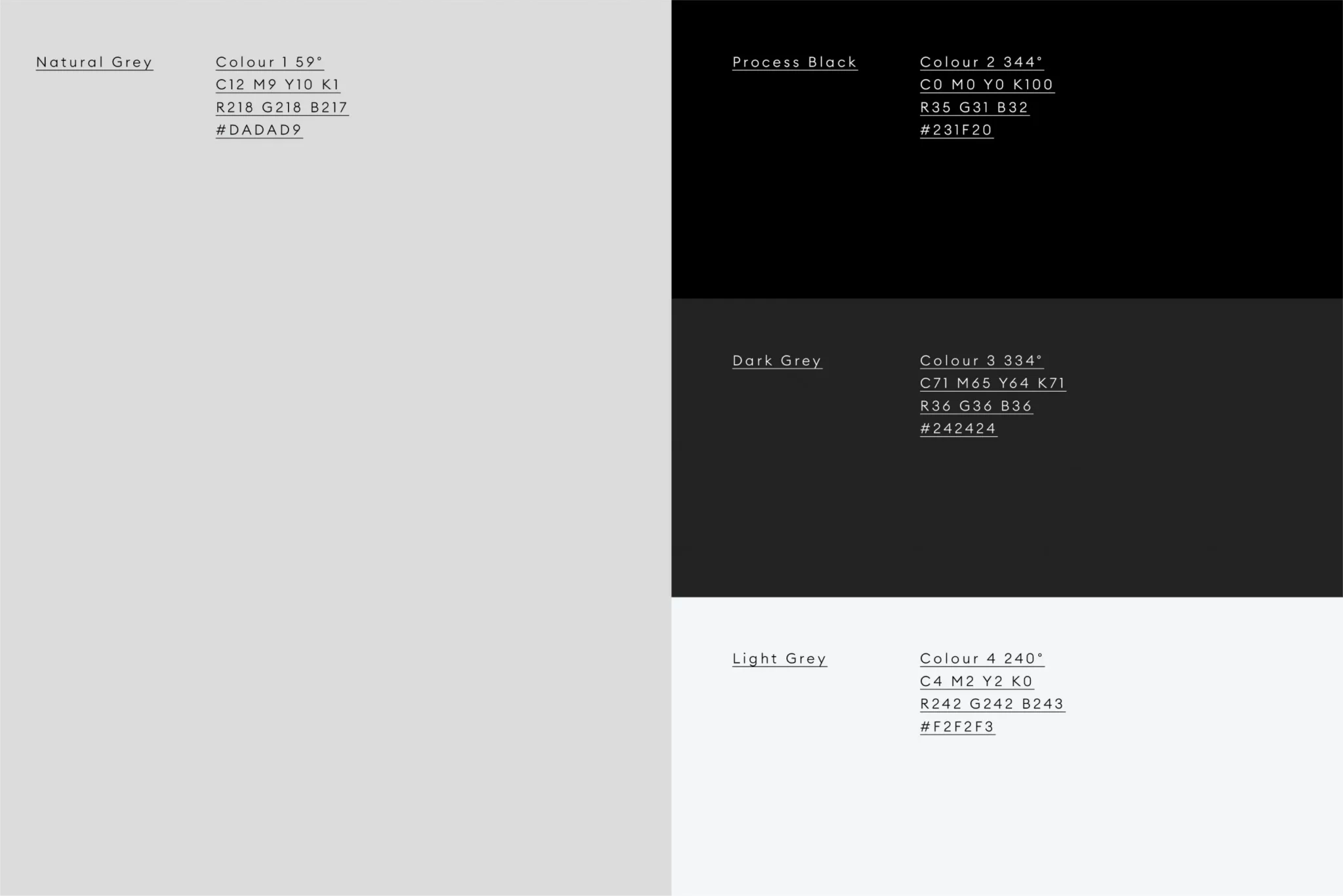
The palette is deliberately quiet – natural grey, process black and two softer greys. The timber does the colour.
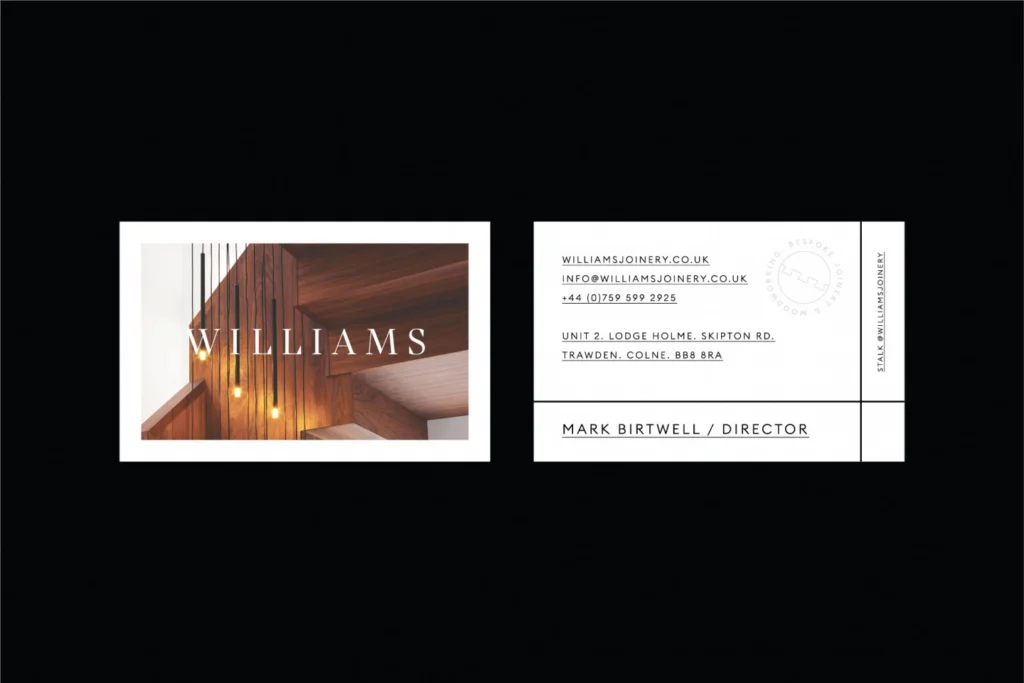
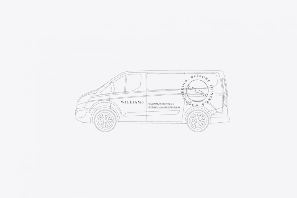
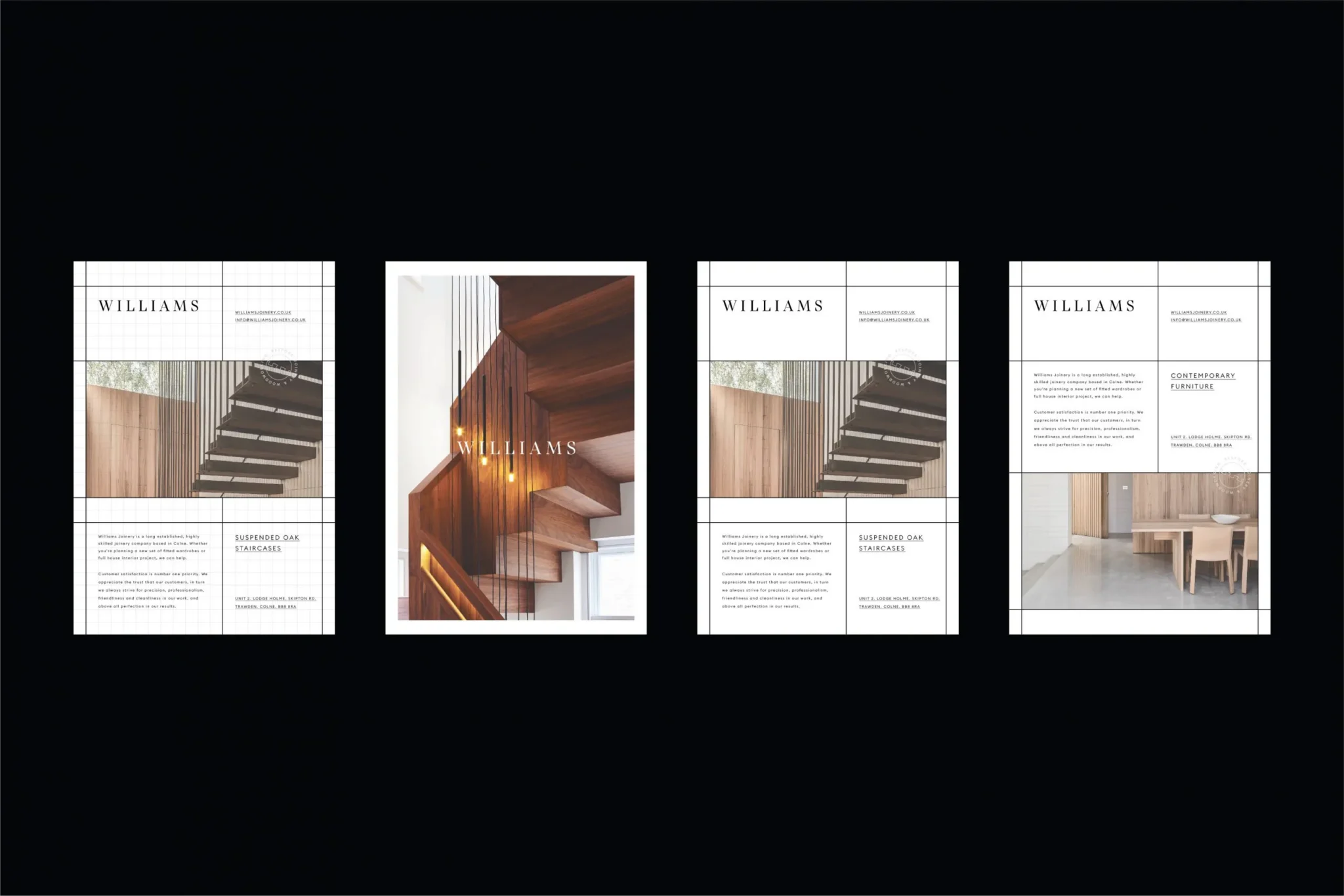
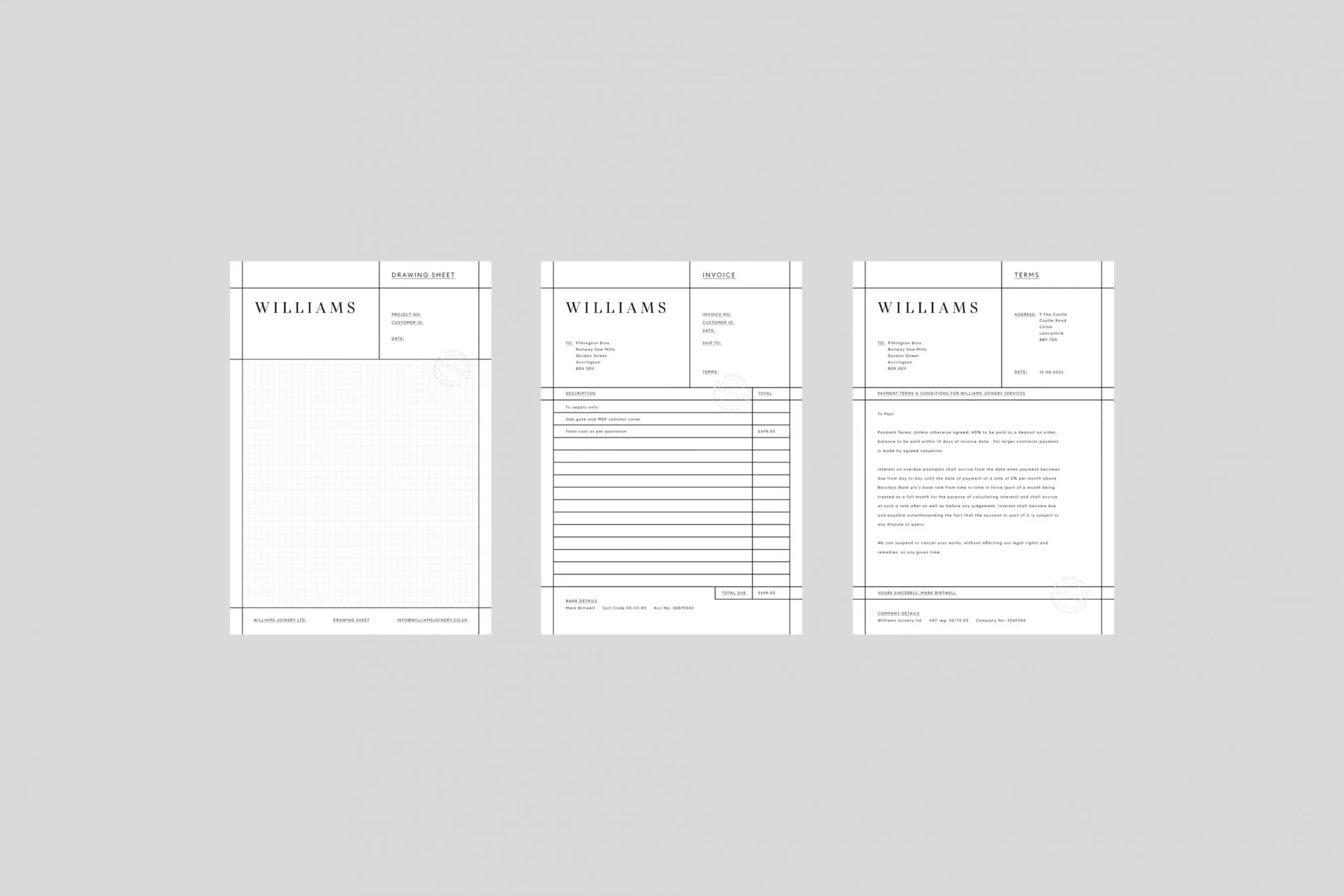
Then the pieces a joiner actually uses. Business cards with a staircase on the front. A brochure of suspended oak stairs and furniture. Drawing sheets, invoices and terms, all set on the same ruled grid. And van livery, so the brand turns up on site too.
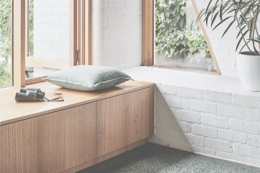
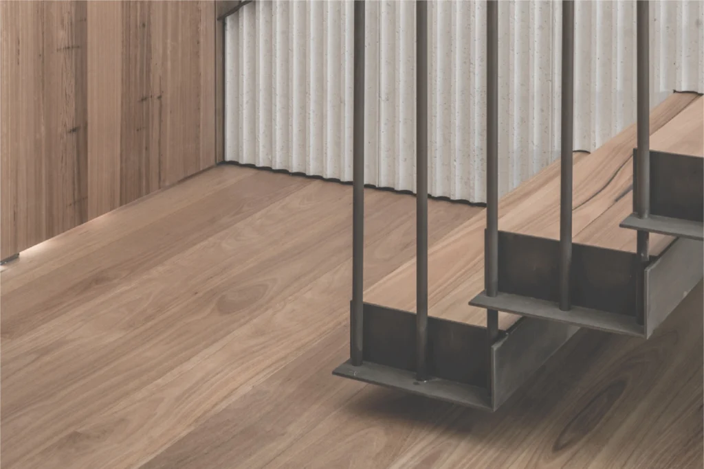
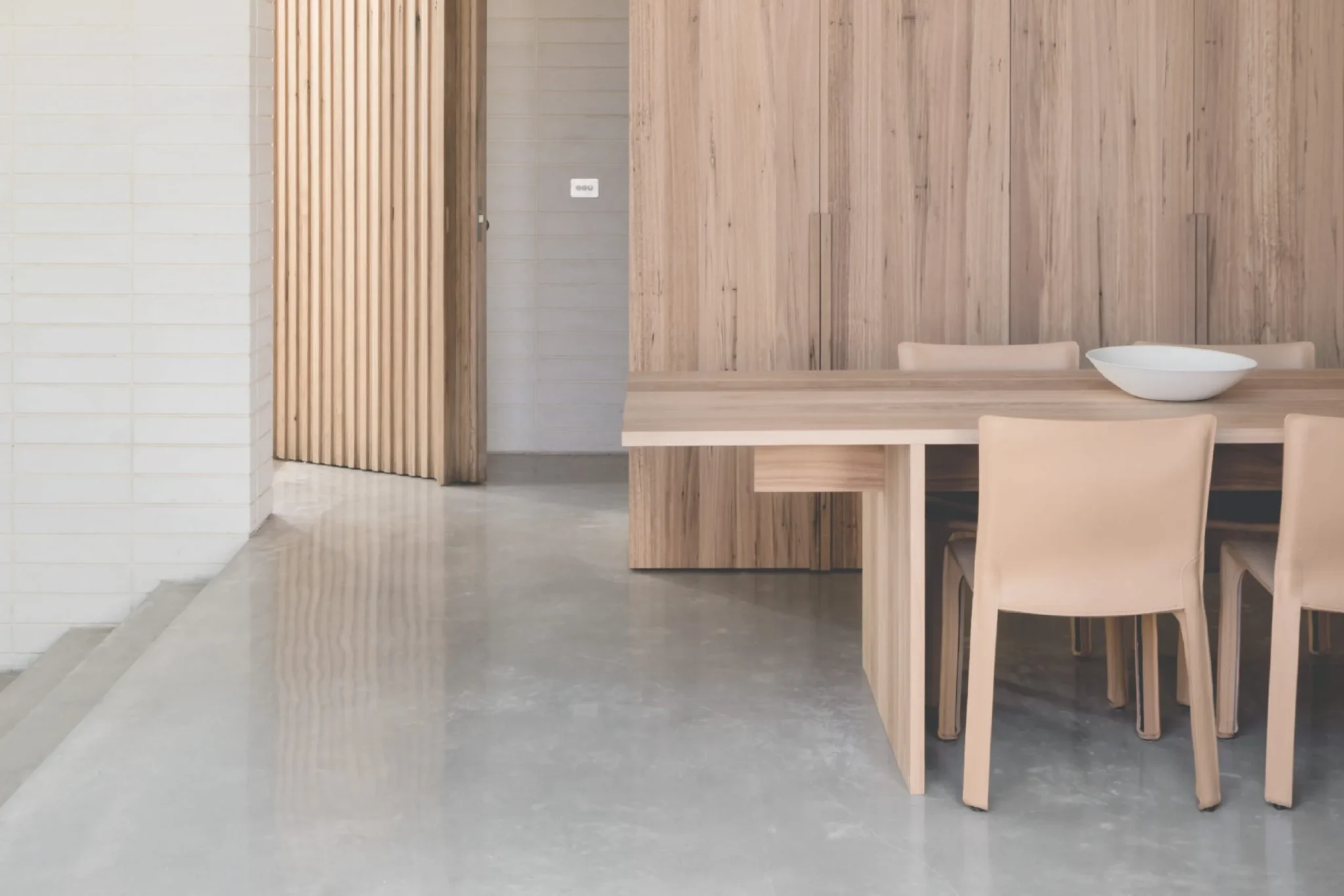
The photography stays close to the detail: stair treads hung from slim steel rods, a window seat against painted brick, cabinetry running floor to ceiling.
I designed and built the website as well, so the brand and the site came from the same hands. It’s a portfolio first – the work up front, with services and the company story a click away. Big pictures, plenty of space and not much to read. The joinery does the talking; it just needed somewhere to stand.